The industry has never agreed on what “design system” means, and people use the phrase for wildly different things: a Figma library, a Storybook, a brand PDF, a set of React components. Alla Kholmatova, whose book Design Systems is the closest thing the field has to a foundational text, opens by refusing that vagueness. Her definition is worth starting from, since the practical decisions you make later all depend on it.
A design system is a set of interconnected patterns and shared practices coherently organized to serve the purpose of a digital product.
Alla Kholmatova“Design Systems”, Smashing, 2017 · Chapter 1Two halves carry the weight. Patterns are the repeating elements you combine to make an interface: flows, interactions, buttons, fields, colour, type, microcopy. Practices are how a team creates, captures, shares and uses those patterns. A pile of components with no shared practice is not a system, it is inventory. The most common and most expensive mistake in the field is mistaking that inventory for the system.
Purpose shapes the patterns: Eikon vs FutureLearn
Kholmatova’s opening example is the clearest way in. Put two products side by side: Thomson Reuters Eikon, a trading and market-analysis terminal, and FutureLearn, an open-education learning site. Both live on the web, but their purposes pull in opposite directions, and so do their patterns.
| Dimension | Eikon (trading terminal) | FutureLearn (learning) |
|---|---|---|
| Purpose | Data, utility, fast scanning, multitasking | Thoughtful reading, reflection, connection |
| Layout | Panel- and widget-based, dense | Mostly single column, spacious |
| Type & controls | Condensed typeface, small headings, compact controls | High-contrast type, large headings, chunky controls |
Neither is “better designed.” Each set of patterns is correct for its purpose. That is the principle everything else in this course rests on: the purpose of the product shapes the design patterns it adopts. A system that ignores purpose and chases generic best-practice produces interfaces that are consistent and wrong.
The two kinds of pattern: functional and perceptual
Kholmatova splits every pattern into two families. It is probably the most useful idea in her book, and it does a lot of work once we reach multi-brand later in the course.
Functional patterns come from the product’s domain and core function: the concrete modules of the interface. A trading tool needs task bars, data grids, charts. A learning site needs articles, discussion threads, progress indicators. An e-commerce site needs a product display, filters, a cart, a checkout.
Perceptual patterns come from the product’s ethos, what most people call the brand: tone of voice, typography and colour choices, iconography, spacing, specific shapes, motion, even sound. Her analogy for the two is linguistic:
Functional patterns are a bit like nouns or verbs, they are concrete, actionable parts of the interface; whereas perceptual patterns are similar to adjectives, they are descriptive. A button is a module with a clear function: allow users to submit an action. But the typographic style in the label of the button, its shape, background colour, padding, interactive states and transitions are not modules. They are styles; they describe what kind of button it is. From a front-end perspective, modules always have a basis in HTML, and perceptual patterns are typically CSS properties.
Alla Kholmatova“Design Systems”, Chapter 1 · Design PatternsThe split explains why two products with identical functionality can feel like completely different things. HipChat and Slack were both team-chat tools with near-identical features, yet they felt nothing alike, entirely because of how brand, the perceptual layer, was expressed through the interface. Same functional skeleton, different perceptual skin. That is also how one design system will later serve four brands.
The functional/perceptual split is the seam a design system is built along. Functional patterns are the shared, purpose-named infrastructure. Perceptual patterns are where brand lives. Almost every advanced topic in this course, tokens, theming, multi-brand, is a way of managing that seam.
Where the idea comes from: Alexander, and a 450-year lineage
The word “pattern” is not a web invention. It comes from the architect Christopher Alexander, whose books The Timeless Way of Building and A Pattern Language asked why some places feel alive and others feel dead, and answered that the difference is not subjective taste but specific, nameable, reusable patterns.
Each pattern describes a problem that occurs over and over again in our environment, and then describes the core of the solution to that problem.
Christopher Alexander“A Pattern Language”, 1977A Pattern Language catalogues 253 patterns, from the layout of a city down to the lighting of a single room. On the web we do the same thing at interface scale: tabs to separate content, a dropdown to reveal options on request. Documenting these systems is far older than software. Kholmatova traces the lineage carefully. Palladio’s Four Books of Architecture (1570) gave rules and vocabulary for buildings, with illustrated patterns and guidance on when to use each. NASA’s Graphics Standards Manual (1975) codified a visual identity. Yahoo’s pattern library was among the first to document interface patterns, and MailChimp’s was among the first “living” libraries where the documentation is the working code. None of this is new. You are joining a practice that runs back 450 years.
The real product is a shared language
Kholmatova’s central claim is that a set of interconnected patterns forms the design language of a product, and that the value of a system is that this language is articulated and shared. A design language usually emerges by intuition. The point of a system is to make that intuition explicit, actionable and reproducible, so a group of people can “follow a creative direction consistently, reliably and coherently” (a goal she borrows from Dan Mall’s idea that a system exists to extend creative direction).
But a shared vocabulary is not enough. Her sharpest practical warning:
It's not only about developing a shared language, we need also to develop a shared use of language. It's not enough to have a shared understanding of the term button. People must also know why and how to use a button, in what contexts, and the purpose a button can serve.
Alla Kholmatova“Design Systems”, Chapter 1 · Shared LanguageThe failure mode is concrete. Suppose a module is meant to be called “Sequence,” signalling ordered steps. If designers call it “Fancy bubbles,” developers call it “Wizard control,” and users read it as optional tabs, the language has failed. Kholmatova reaches for Don Norman’s The Design of Everyday Things and the gulf between the system image (the interface) and the user’s model (what they think it does). Her formulation: an effective design language bridges the gap between the system image and the assumed user model. Naming is how that bridge gets built, and that is what the whole of Lecture 3 is about.
The library is not the system
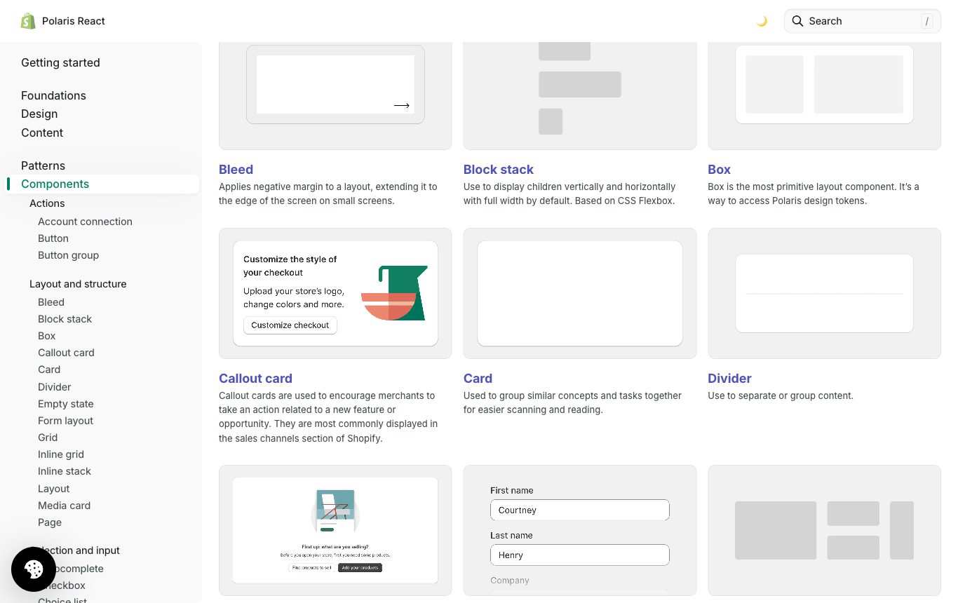
This is exactly the confusion your clients will bring you. A pattern library, a Figma file, a Storybook, is a tool for capturing and sharing patterns. It is not the system.
Even the most comprehensive and living pattern library is not the system itself. It's a tool that helps to make a design system more effective... No pattern library will fix bad design. When a pattern library is used to support a solid design language foundation, it becomes a powerful design and collaboration tool. Until then, it's a collection of modules on a web page.
Alla Kholmatova“Design Systems”, Chapter 1 · The Limitations of Pattern LibrariesMichael McWatters, UX architect at TED, puts the same truth bluntly: “even a Squarespace template can be ruined by sloppy design thinking.” A library reflects the system behind it. A rigid system produces a library that exposes the rigidity; a system that allows experimentation gets a library that makes experimenting easier. The tool amplifies whatever thinking sits underneath. So when a client hands you a polished UI kit and calls it their design system, the honest answer is that they have a component library, one artefact of a system that also needs shared practices, naming, governance and people to be real.
What makes a system effective
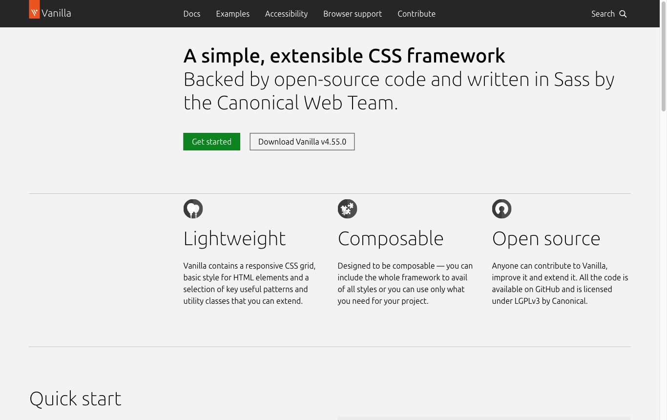
The measure is not coverage. Kholmatova defines it against purpose, borrowing Donella Meadows’ Thinking in Systems: no system exists in isolation, and subsystems aggregate into larger ones. Your design system sits inside your product, your team, your company culture.
A design system can be considered effective when it combines cost-effectiveness in the design process, and efficiency and satisfaction of the user experience in relation to the product's purpose.
Alla Kholmatova“Design Systems”, Chapter 1 · What Makes an Effective Design SystemSo there are two tests. Does the system make the team faster and cheaper to design and build? And does it make the user’s experience more efficient and satisfying for what the product is for? A system that scores high on consistency but does not serve the purpose has optimised the wrong variable. Dan Mall turns the same instinct into a delivery doctrine, adoption over coverage, which we develop in the business tier.
A worked example: the ten-minute recipe site
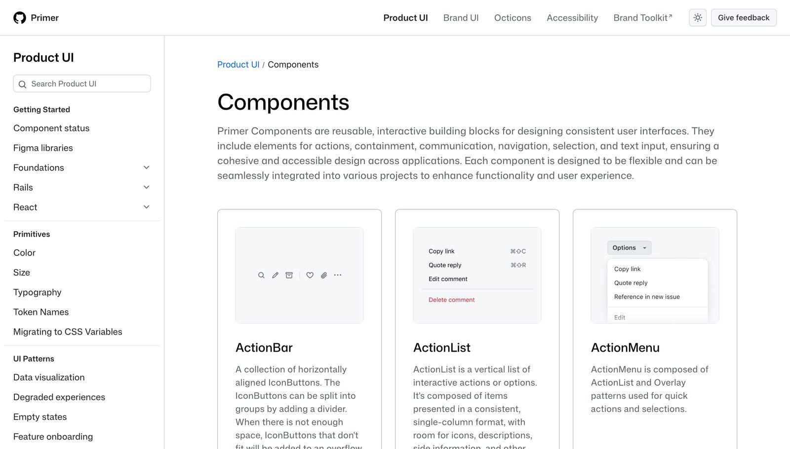
Kholmatova walks a fictional build to show how a language actually emerges. Pay attention to the order, because it is the order you will use on real work.
- Purpose & ethos. One sentence: “Motivate and empower people to cook delicious healthy meals in no more than ten minutes.” Ethos: simple, healthy, experimental. Everything else is shaped by this.
- Principles. The team takes the value of time to heart, so interactions are short, simple and fast, which shows up in the patterns, the performance and the tone.
- Behaviours to functional patterns. From the behaviours you want to enable (choose home-cooked over microwaved, finish in ten minutes, be spontaneous) fall the core modules: ingredient thumbnails, recipe cards, a step sequence, a timer.
- Aesthetics to perceptual patterns. Deciding how you want to be perceived, warm, wholesome, unfussy, yields the perceptual layer: an earthy palette, hand-drawn icons, readable type, quality food photography.
- Shared language. Naming decisions (“recipe,” “steps,” a “delightfully simple” interaction) start informal and get captured as the team grows.
The sequence runs purpose, then principles, then behaviours before modules, then aesthetics, then language. Nobody drew a button library first. The system grows out of purpose, which is why a component kit handed over with no purpose behind it is inert.
The panel: where the authorities agree and diverge
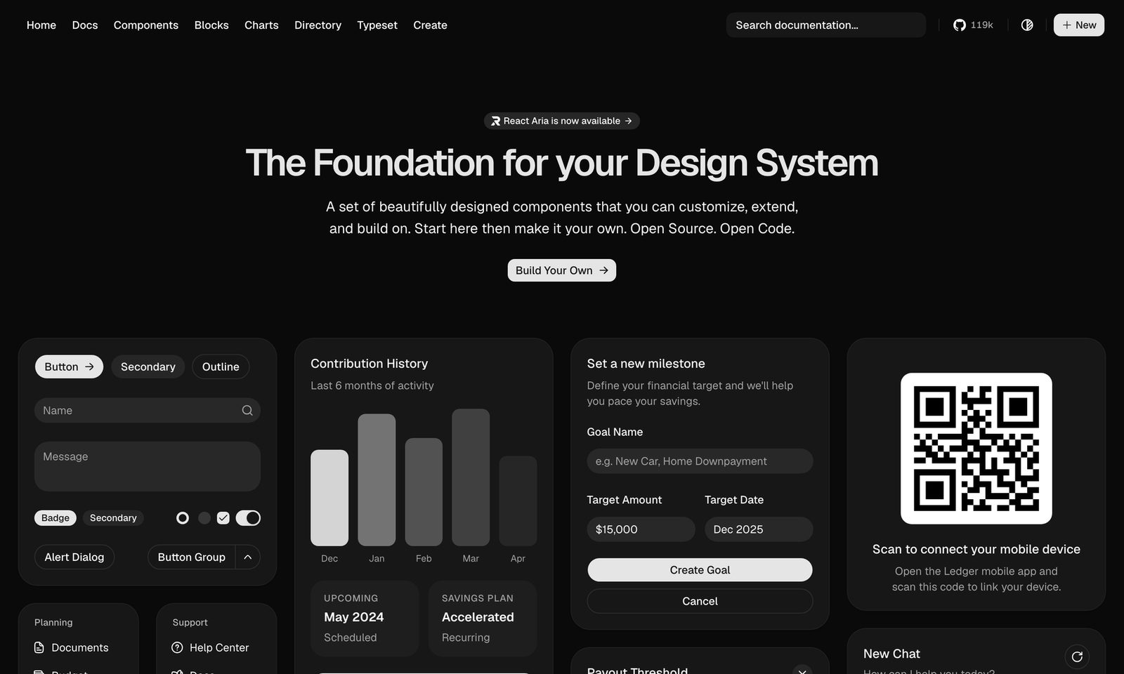
Kholmatova says the system is a shared language and a set of practices, and the library is a tool. Dan Mall agrees the system is more than artefacts and adds a delivery stance: never build the system first, extract it from a real pilot, and measure it by adoption rather than coverage. Brad Frost supplies the vocabulary most teams actually speak, atomic design, atoms to pages, though as we will see he arrived at it via chemistry, not Alexander. The interesting tension is not who is right but when each applies. Kholmatova is language-first, in-house and evolutionary; Mall is pilot-first, agency, extract-from-real-work. For client work you will lean on Mall for delivery and Kholmatova for structure, and we come back to this in every module.
A design system is a shared language and the practices that keep it alive, serving a purpose. The Figma file is a tool for it, not the thing itself.
Further reading
- Alla Kholmatova: Design Systems (Smashing, 2017)
- Brad Frost: Atomic Design (full text)
- Nathan Curtis: “A Design System Isn’t a Project, It’s a Product Serving Products”
- Christopher Alexander: A Pattern Language
- Canonical: Vanilla framework (the system behind Ubuntu)
- Material 3: Design Kit (Figma community file)
- Apple: Design Resources for Figma