
In Lecture 1 we established that a design system is a shared language and the practices that keep it alive. Tokens are how that language gets written down in a form both a designer and a compiler can read. In the front-end lineage, Micah Godbolt frames the whole enterprise cleanly: a design system is “the programmatic representation of a website’s visual language.” Tokens are the vocabulary of that representation. This lecture builds the mental model you need before you touch a single Figma variable. Get the model right and the tooling in Tier II is trivial; get it wrong and the same tooling works against you.
A design system is the programmatic representation of a website’s visual language. The visual language, created by our designers, is an artifact that expresses how the website visually communicates its message to users. It is a collection of colors, fonts, buttons, image styles, typographical rhythms, and UI patterns used to convey mood, meaning, and intent.
Micah Godbolt“Frontend Architecture for Design Systems”, O’Reilly, 2016: Chapter 4What a token actually is
The phrase “design tokens” was coined at Salesforce around 2014 by Jina Anne with Jon Levine, and Sönke Rohde built the first transform tool, Theo, to turn one source of truth into per-platform outputs. The origin tells you something: tokens were born as a pipeline idea, not a naming convention. The canonical Salesforce Lightning Design System definition is worth knowing by heart:
Design tokens are the visual design atoms of the design system. Specifically, they are named entities that store visual design attributes. We use them in place of hard-coded values (such as hex values for color or pixel values for spacing) in order to maintain a scalable and consistent visual system for UI development.
Salesforce Lightning Design SystemDesign Tokens documentation: definition authored under Jina AnneThree words in that definition carry the whole idea. Named: the token has an identity independent of its value. Store: it holds a value now, but the value can change without the name changing. In place of hard-coded values: nothing in the interface points at #0B5FFF directly, everything points at the name. That indirection is the entire trick.
A hex value in a component is a fact stated once, in one place, that no other place can see. A token is the same fact stated once but visible everywhere. The difference between those two is the difference between a UI kit and a design system.
Tokens are a methodology, not variables
The most common beginner error is to hear “token” and think “CSS custom property” or “Figma variable.” Those are outputs. Jina Anne is emphatic that a token is a methodology: a single abstract source value that gets transformed, per platform, into whatever that platform needs. The same token color.background.brand becomes a hex string for the web, a UIColor for iOS and an XML color for Android, all generated from one entry. That is why the lineage runs Theo, then Style Dictionary (Amazon), then the DTCG standard. The tool changes and the methodology stays put.
Godbolt describes the underlying move as deconstruction, and his linguistic framing rhymes exactly with Kholmatova’s from Lecture 1:
Just as a spoken language can be broken down into nouns, verbs, and adjectives, our job as frontend developers is to deconstruct the visual language into its smallest pieces. By doing this, we can create rules about how to put it back together again.
Micah Godbolt“Frontend Architecture for Design Systems”: Chapter 4, Modular DesignTokens are those smallest pieces, plus the rules for putting them back together. You are not naming variables. You are encoding decisions in a portable, transformable data layer.
Options versus decisions: the Curtis frame
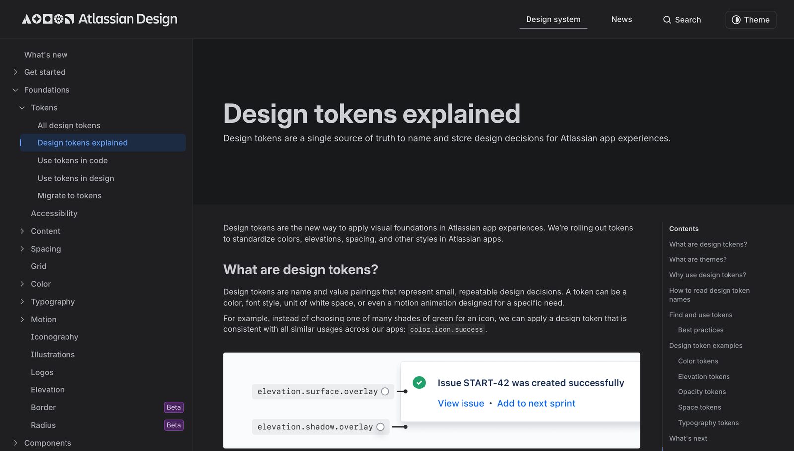
Nathan Curtis of EightShapes gave the field the distinction that makes every later tier make sense. In “Tokens in Design Systems” (2016) he splits every token into one of two roles.
Options are all the choices available in a system, like a palette of many colors or a spectrum of spacing values. Decisions apply an option to a context, encompassing where and how a choice is applied.
Nathan CurtisEightShapes: “Tokens in Design Systems”, 2016color-neutral-42 is an option: it answers “what do I have available.” color-background-disabled is a decision: an option applied to a context. The option layer is raw inventory. The decision layer is where meaning and intent live, and it is what a theme overrides. Curtis distils it into one line, which sits well next to Kholmatova’s from Lecture 1:
Tokens are Decisions, Propagated Through a System.
Nathan CurtisEightShapes: title thesis, “Tokens in Design Systems”Take the three words apart. Decisions, not values. Propagated, meaning the point of a token is that it fans out. Through a system, which is how one edit re-skins an entire product. The decision layer earns its extra indirection because one option can feed many decisions, and you only ever want to author the mapping once.
| One option feeds many decisions | Token | Role |
|---|---|---|
| The raw brand hue | blue-600 = #0B5FFF | Option (what I have) |
| Primary action background | color-action → blue-600 | Decision (applied to a context) |
| Selected row highlight | color-selected → blue-600 | Decision |
| Focus ring | color-focus-ring → blue-600 | Decision |
| Link text | color-text-link → blue-600 | Decision |
The payoff is now visible. If the brand hue moves to #1656E0, you edit one option and every decision downstream inherits it. But because the decisions are named by intent, you can also break the link: if legal insists the focus ring go higher-contrast, you repoint color-focus-ring alone, without disturbing links or actions. Options give you consistency, decisions give you divergence you actually meant. That is what a token layer buys you, and it is why binding a component directly to blue-600 and skipping the decision is the cardinal sin we return to below.
Frost’s three tiers
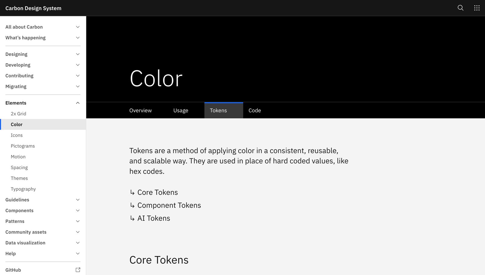
$background and $layer mapped to a role and a value. Source: carbondesignsystem.comBrad Frost formalised the layering into the model almost every serious system now speaks, in “The Many Faces of Themeable Design Systems” (2022). His exact tier language:
Tier 1: Option tokens (also called base, global, primitive, or reference tokens) define the full range of options available in the design system, such as the entire color palette, spacing values, font sizes, and more. Tier 2: Decision tokens (also called semantic, alias, or theme tokens) apply those options to specific use cases, and this is where the theming magic happens. Tier 3: Component tokens map decision tokens to specific components, giving component authors fine-grained control while still inheriting from the theme above.
Brad Frost“The Many Faces of Themeable Design Systems”, bradfrost.com, 2022Frost’s Tier 1 and Tier 2 are literally Curtis’s options and decisions, renamed and stacked. Tier 3 is new: a per-component layer, button-primary-background, that reads from Tier 2 rather than Tier 1. The rule that makes the whole stack work is directional and strict: each tier may only reference the tier above it. A component reads a decision, a decision reads an option, an option reads a literal value. Never skip a tier, never point upward. Swap the Tier 2 mapping and every component re-themes without a single component file being touched.
| Tier | Also called | Example | Question it answers |
|---|---|---|---|
| 1 · Option | base, global, primitive, reference | color-brand-green, blue-600 | What raw values exist? |
| 2 · Decision | semantic, alias, theme | theme-color-primary-background | What does a value mean here? |
| 3 · Component | component-scoped | button-primary-background | How does one component consume it? |
The same idea, four dialects: Material, Polaris, Atlassian, Carbon
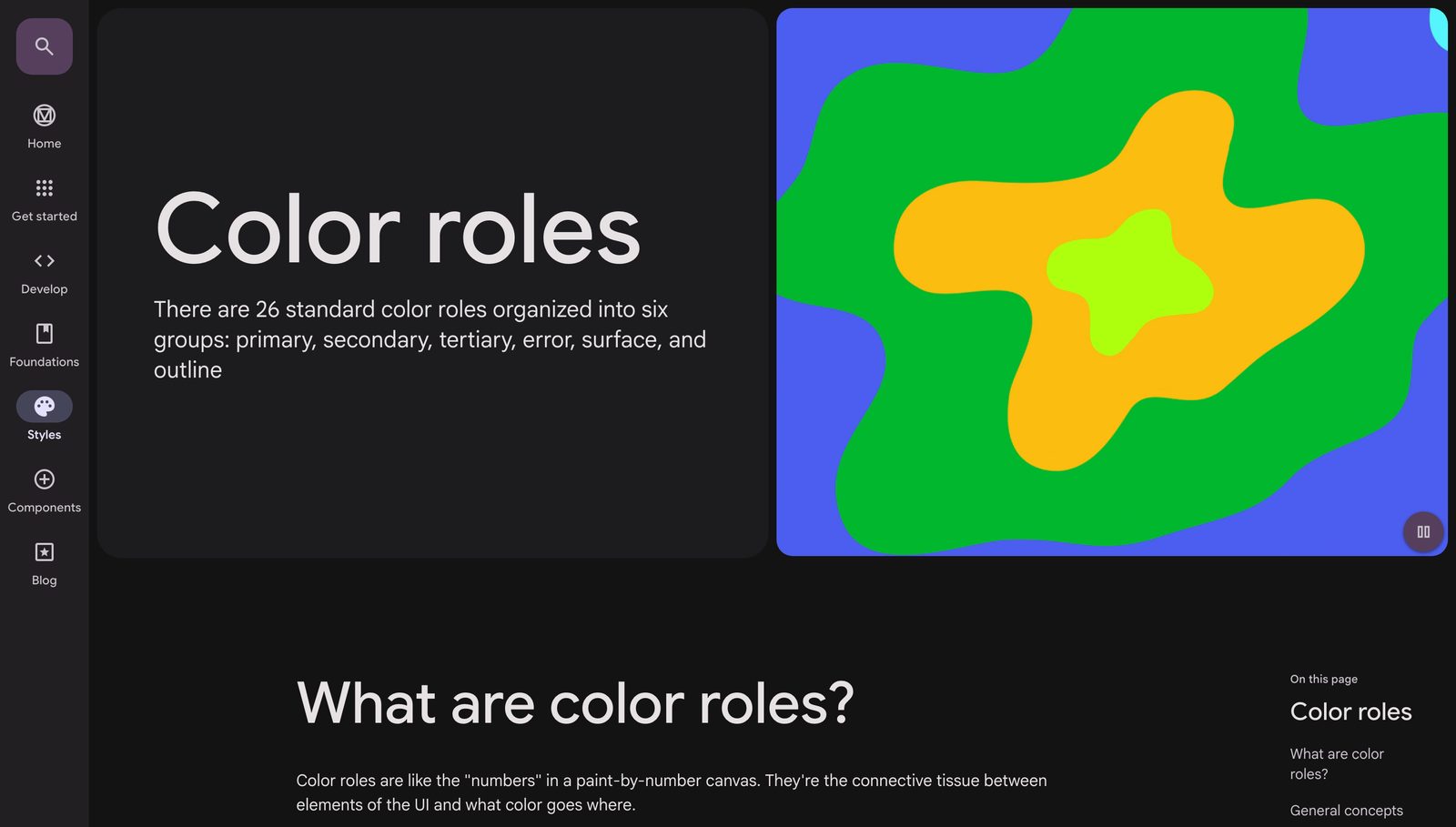
Here is where the theory earns its price. The major public systems all accept the token model but disagree, productively, on how many tiers to expose and what to make public. Once you know these dialects you can read any system on sight and pick one for a client.
| System | Public tiers | Naming example | Theming mechanism | The stance it represents |
|---|---|---|---|---|
| Material 3 | 3 (ref / sys / comp) | md.sys.color.primary | Algorithmic: the HCT color engine generates the palette | Maximal formalism. Tokens are the interface to a color engine, not hand-picked swatches. |
| Shopify Polaris | 1 flat semantic | --p-color-bg-surface | Base plus overrides, light-first | Single-product minimalism. Flatness as strategy. |
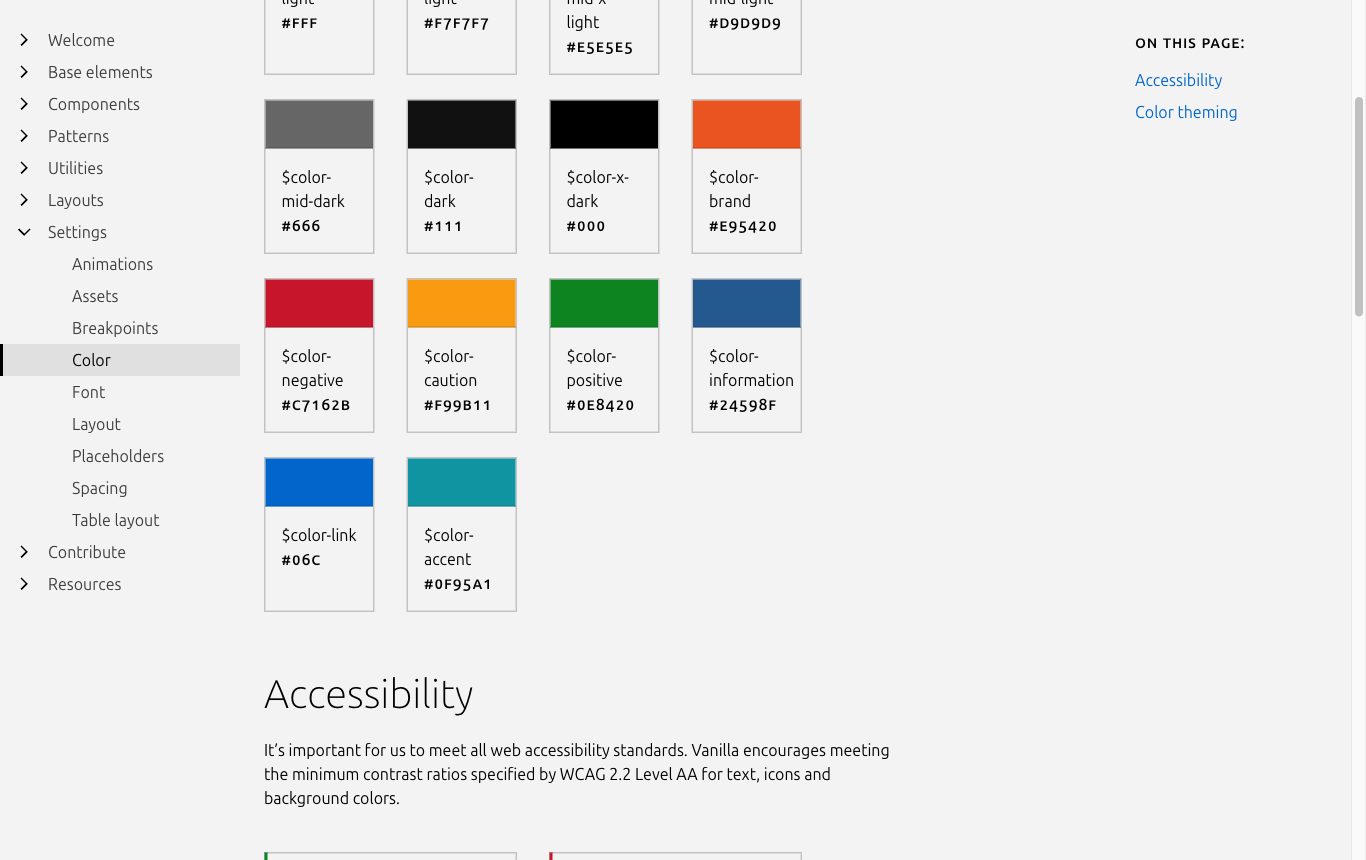
| Atlassian ADS | 2 (palette hidden) | color.background.brand.bold | light / dark / high-contrast, formal token lifecycle | Semantic-only contract. The decision layer is the only public API. |
| IBM Carbon v11 | 2 | $layer-01, $text-primary | Four fixed themes as variable modes in one library | Themes-as-modes plus contextual layers. |
Material 3 pushes formalism furthest. Its three tiers, md.ref (reference), md.sys (system) and md.comp (component), map one-to-one onto Frost’s option, decision and component. But the reference palette is not chosen by hand. It is generated by the HCT (Hue, Chroma, Tone) color engine from a single source color, so even the option tier is machinery. It is the most complete taxonomy in public existence and also the most over-engineered for a small team.
Polaris is the deliberate opposite. Shopify exposes essentially one flat semantic tier, --p-color-bg-surface, tuned to exactly one product, the Shopify admin. Flatness is the strategy: fewer names, one vocabulary, no ceremony. The 2023 v12 restructure of that flat layer let them re-skin the entire admin in roughly ten weeks, which is about as concrete as an argument gets that a small, well-named decision layer beats a deep taxonomy for a single product.
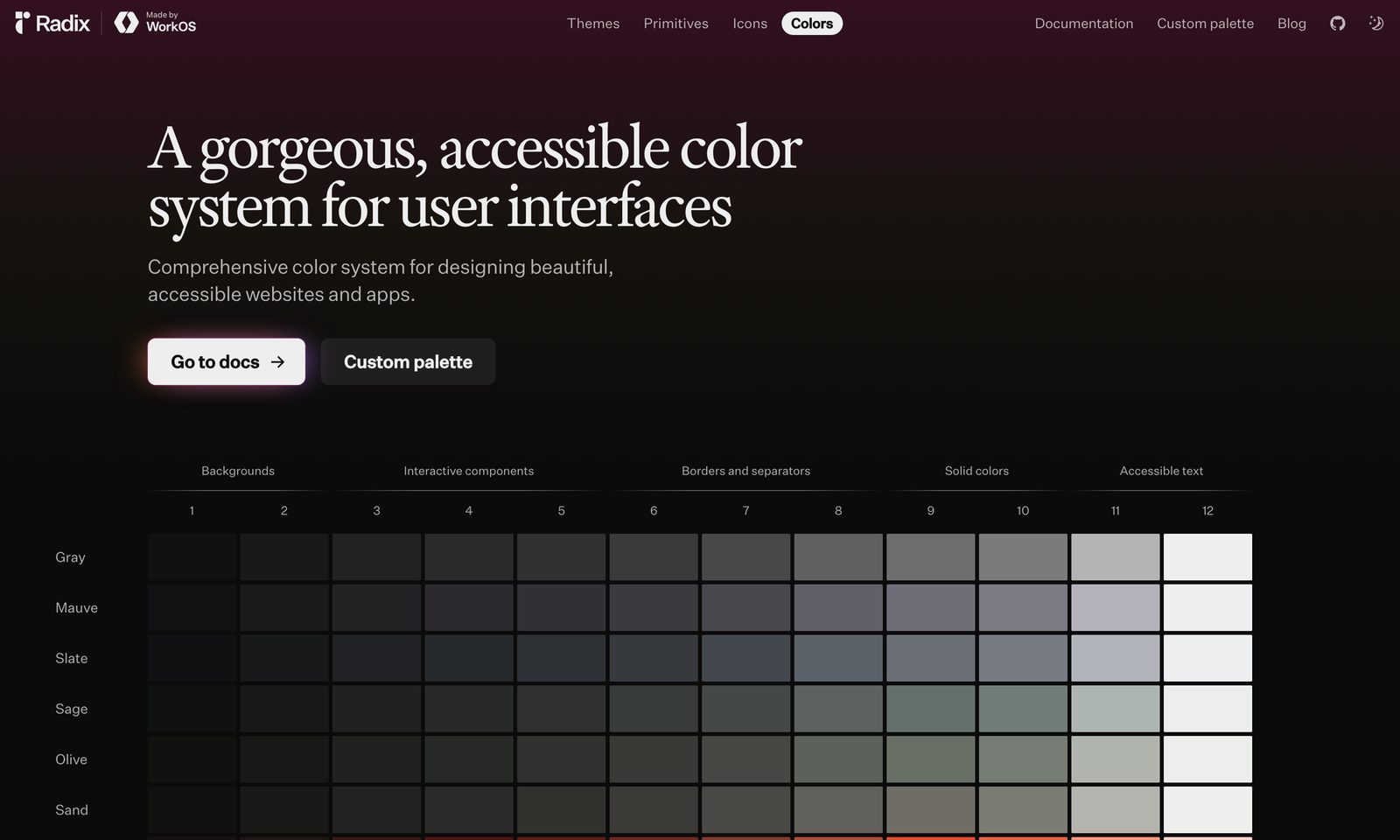
Atlassian makes the sharpest doctrinal claim: semantic tokens are the only supported API, the raw palette is deliberately backgrounded, and tokens move through a formal lifecycle (active, then deprecated, then deleted). Their guidance names the exact anti-pattern this lecture warns against:
Don’t choose a token based on its color. Choose a token based on its intended purpose. Just because a color matches doesn’t mean it’s the right token to use.
Atlassian Design SystemDesign tokens: usage guidance, atlassian.designCarbon contributes the layer idea. Its $layer-01, $layer-02, $layer-03 tokens map to how deeply a surface is nested, so a card on a card on a page each gets the correct background without anyone hand-picking greys. v11 also consolidated four themes into variable modes inside a single library, which is the pattern Tier II of this course adopts for multi-brand.
None of these wins outright. The number of tiers is a choice driven by how many products and brands the system serves. One product, go Polaris-flat. Fifteen brands off one engine, go Material-deep. Four event brands off a shared core, which is the running case in this course, means two tiers with brand as a mode, the Carbon shape.
The standard that makes tokens portable: W3C DTCG
Until recently every tool invented its own JSON shape, so a token file from one vendor could not be read by another. The W3C Design Tokens Community Group fixed that. The Design Tokens Format Module reached its first stable version, 2025.10, on 28 October 2025. Be precise when you sell it: it is a Community Group Report, not yet a formal W3C Recommendation. It is already the lingua franca all the same.
A DTCG token is a JSON object with reserved keys. $value holds the value, $type declares what kind of value it is (color, dimension, duration, and so on), and an alias references another token by path in curly braces. That alias syntax is how you express Frost’s tier references in plain data. The decision-references-option pattern looks like this:
"blue-600": { "$type": "color", "$value": "#0B5FFF" }
"color-action": { "$type": "color", "$value": "{blue-600}" }
The spec is explicit that tools must follow the alias to resolve the real value, which is what lets one edit to an option cascade through every decision that references it. Primitive types include color, dimension, duration, font family, font weight and cubic-bezier. Composites include shadow, border, gradient and typography. Modern color spaces (Display P3, Oklch, CSS Color 4) are first-class.
A standard matters for client work because vendor-neutral tokens are the handoff artefact. When your tokens are DTCG JSON, they flow through Figma, Tokens Studio, Style Dictionary, Penpot, Framer and Terrazzo without a rewrite. You are not selling a Figma file locked to one tool. You are selling a portable source of truth the client owns and can transform to any platform. That portability is the commercial reason the whole pipeline in Tier III is worth building.
Brandable versus constant: the theming contract
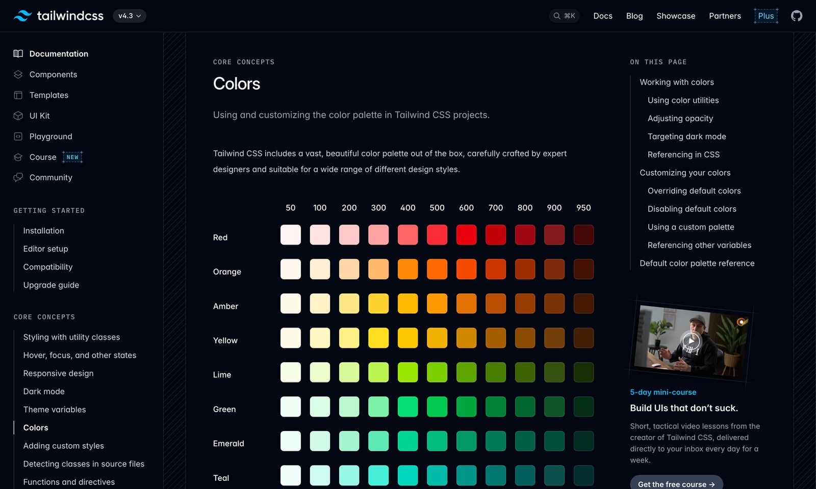
Not every token is up for grabs when a brand skins the system. Jina Anne’s most practical governance idea is to split tokens into two classes before theming begins. Some tokens are brandable, meaning a brand may override them: brand color, display typeface, corner radius, imagery treatment. Others are constant, locked system-wide because changing them would break something non-negotiable, like feedback colors users have learned, focus-state visibility, and above all contrast-critical values.
Here accessibility stops being advice and becomes a lock. WCAG 2.2 (now also ISO/IEC 40500:2025) sets 1.4.3 Contrast at 4.5:1 for normal text and 3:1 for large text, and 1.4.11 Non-text Contrast at 3:1 for UI components. A semantic token like color-text-on-primary must encode that ratio by design, not by luck. So the theming contract reads: a brand may repoint color-primary to any hue it likes, but color-text-on-primary is constant machinery that must always resolve to a foreground passing 4.5:1 against whatever color-primary now is. Brandable freedom sits on top of a constant accessibility floor. Writing that one-page brandable-versus-constant list is the first governance deliverable on any real multi-brand engagement.
The theming contract is a single table: for every token, one column says brandable or constant. Contrast-critical pairs, feedback colors and focus states go in the constant column and never leave it. Everything a brand is allowed to touch goes in brandable. Agree this before you make a single Figma variable.
The anti-patterns
Token smells that will cost you a rebuild
- Binding components to primitives. A button that reads
blue-600directly (skipping the decision tier) cannot be re-themed without editing the button. Components read Tier 2 only. This is the single most expensive mistake. - Appearance-named tokens.
color-blue,token-red-button,bg-light-grey. A “pink” button can only ever be pink (Kholmatova’s exact warning, developed fully in Lecture 3). Name by intent,color-action, not by pixels. When the brand goes green, appearance names become lies. - Too many tiers. Three tiers is a ceiling for most work, not a target. Adding a fourth or fifth layer of indirection buys nothing and makes every trace-through painful. Polaris ships one public tier and re-skins an admin in ten weeks.
- Values without meaning. A decision token whose name does not tell you where it belongs (
color-token-2,brand-secondary-alt) is an option wearing a costume. If you cannot state the context in the name, you have not made a decision yet. - Matching by color, not purpose. Reaching for
color-surface-sunkenon a button because the grey happens to match. Atlassian: “Just because a color matches doesn’t mean it’s the right token to use.”
The dissent: Kholmatova on twenty shades of blue
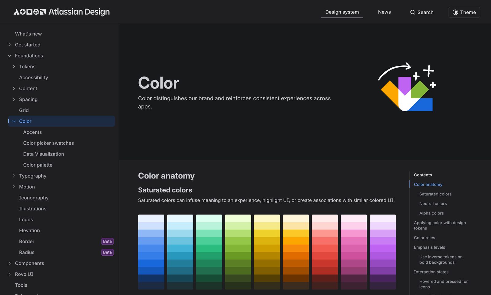
A course that only quotes token enthusiasts is selling you a religion. Alla Kholmatova, whose definition anchored Lecture 1, is pointedly skeptical of starting from variables at all, and she never uses the word “token.” Her argument is that a standardised palette is necessary but nowhere near sufficient, because the hard part is shared use, not shared values:
Even with a standardized color palette there's still plenty of scope for interpretation. What do the values represent? Which variation of green should you use? How do the colors work together? A set of shared colors is not enough. You also need a shared use of color in the context of the product.
Alla Kholmatova“Design Systems”, Smashing, 2017: Systemizing Perceptual PatternsAnd the line that names the whole tension:
Having twenty shades of blue isn't an issue, if blue has a consistent meaning throughout the interface.
Alla Kholmatova“Design Systems”: on the systemization of colorRead carefully, this is not a rejection of tokens. It is a warning about the order of operations. Building blocks (variables) come last, not first. You start from roles and meaning (“what is blue for here”), audit real instances, define patterns of usage, and only then crystallise the token. A team that opens Figma and starts spinning up blue-100 through blue-900 before deciding what blue means has built an option layer with no decisions. That is the “collection of modules on a web page” failure from Lecture 1, wearing a token hat. Curtis, Frost and Jina would all agree. Kholmatova just says it loudest.
The panel: where the authorities agree and diverge
They agree on the core. Jina, Curtis and Frost all hold that a design system needs a layer of named, purpose-driven values sitting in front of raw literals, and that theming happens by swapping the meaning layer, not the components. Godbolt supplies the framing (deconstruct the visual language into pieces plus rules). Curtis supplies the two roles, options and decisions. Frost stacks them into tiers. Jina makes it a portable, transformable methodology and adds the brandable-versus-constant contract. DTCG makes it a standard.
They diverge on depth and starting point. Curtis is local-first: keep a value inside a component until roughly three components need it, then promote it and assign a curator so the vocabulary does not sprawl. Frost is global-first: define the full option palette up front, then build decisions on top. These are genuinely opposite build orders, and which you pick depends on whether you are extracting a system from live product (Curtis) or standing up a themeable stack deliberately (Frost). On tier count, Material argues for three public tiers and an engine while Polaris argues for one flat tier, and both ship at scale, so tier count is a fit decision, not a correctness one.
Kholmatova sits outside the frame and checks it. Her contribution is the reminder that a token without an agreed meaning is just a variable, and that meaning comes from purpose and shared use, both of which precede any tooling. For client work you will lean on Frost and Curtis for structure, Jina for the pipeline and the contract, DTCG for portability, and Kholmatova for the discipline of not opening the variables panel until you know what each value is for.
A token is a decision, named by intent, stored once and propagated through the system: components read decisions, decisions read options, options hold literals, and theming is nothing but repointing the decision layer. Everything else in the pipeline is plumbing on top of this one idea.