
Everything in this course has been building to a single question: given a real job, in what order do you actually do the work? Not the theory of tokens, not the taxonomy of naming, but the sequence of moves that takes you from a blank Figma file to a system a second brand ships on and a team keeps alive after you leave. This capstone walks that sequence end to end on one scenario, with every authority you have met placed at the stage where their advice pays off.
The scenario: Northwind launches a second brand
Keep one concrete situation in your head for the whole lecture. Northwind is an established software company with a single product, a project-management tool, and a mature-enough web presence: a marketing site and an app, both built over years without a formal system. Leadership has decided to launch a second brand, Northwind Studio, a lighter, design-focused product aimed at a different, more expressive audience. Same company, same engineering org, genuinely different personality. The mandate you are handed sounds like “build us a design system so both brands stay consistent.” That mandate is a trap, and seeing why is the first move.
A second brand is the perfect forcing function for a design system, because it is exactly the moment Dan Mall calls an inflection point: a rebrand or a new product line where system work can hitch onto momentum the business already wants. You do not have to sell “design system.” You sell “Northwind Studio ships faster and looks unmistakably itself.”
The charge: do not build the system first
The single most expensive mistake you can make on this job is to open Figma and start building a component library for two brands. That produces what Mall calls a design-system graveyard: a well-architected library nobody adopts, because it was built for no one in particular.
Stop trying to make a design system by making abstract components. Instead, give your team a use case... The answer is to start with product. Product comes before system.
Dan Mall“Design That Scales”, Rosenfeld, 2023: Chapter 5So the charge for the capstone is Mall’s: extract the system from one real pilot. Pick a single page that Northwind is going to build anyway, build it for real, and let the reusable parts fall out of that work. The system is the notes in the margin of real product work, not a textbook written in advance. Everything below is one turn of Mall’s Measuring Spoon Cycle: make a page, extract components, apply them to the next thing (here, the second brand), and repeat.
Which page? Score the candidates on Mall’s pilot scorecard, roughly: potential for common components, a high-value element at the core, technical feasibility, a champion, scope you can finish in three to four weeks. For Northwind, the winner is the pricing page: high business value, dense with reusable parts (buttons, cards, a plan comparison, a call to action), self-contained, and something both brands will need on day one. That is our pilot. In Mall’s taxonomy it is a Facelift pilot, since we are extracting a system while establishing a new visual language for the second brand.
Stage 1 · Frame it: inventory, split, name by purpose
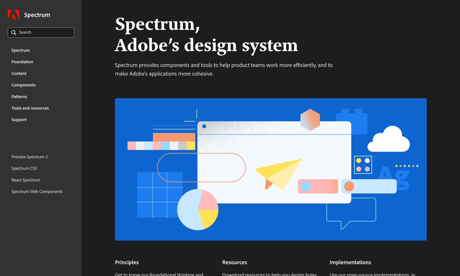
Before a single token, understand what the pricing page actually contains. This is Kholmatova’s ground, and the moves are hers.
Interface inventory. Print or paste every distinct element on the pricing page and group it, but not by appearance. Group by the behaviour each element supports, Kholmatova’s purpose-directed inventory. You will end up with things that look different in the same group because they do the same job.
The functional / perceptual split. Now draw the seam the entire system will be built along. Sort every element into two families: functional patterns (the modules, the concrete building blocks) and perceptual patterns (the styles that describe what kind of module it is).
| On the pricing page | Functional (shared across both brands) | Perceptual (differs per brand) |
|---|---|---|
| Plan comparison | Card, price display, feature list, plan-select button | Card radius, shadow depth, accent colour, heading type |
| Primary call to action | Button, its label, its action | Fill colour, corner radius, weight, hover motion |
| Page voice | Heading, body, caption hierarchy | Typeface, scale, tone of voice, spacing rhythm |
This split is the whole reason one system can serve two brands. The functional column is the shared skeleton Northwind and Northwind Studio hold in common. The perceptual column is where the two brands diverge. It is the HipChat-and-Slack mechanism from Lecture 1, made operational: same functional bones, different perceptual skin. Draw the seam right and multi-brand is nearly free. Draw it wrong and you fork the whole library per brand.
Name by purpose, not appearance. As you define each functional pattern, name it for what it does. The plan-select button is button/primary or, better, named by its action; it is never button/blue. Kholmatova’s rule: once you name an object you shape its future, and a “pink” button can only ever be pink. That matters doubly here, because Northwind Studio’s primary is not going to be Northwind’s blue. Curtis says the same in his grammar: name the decision for its context, not its current value. If you struggle to name something, that is Kholmatova’s red flag that you have not understood its purpose yet.
Stage 2 · Build the tokens and one component
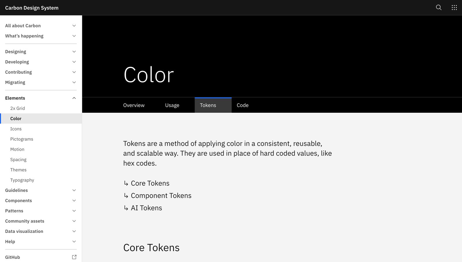
Now, and only now, build tokens, and only the ones the pricing page demands. Not a token bible. Just the primitives, one semantic layer, and one component wired correctly. This is Lecture 2’s mental model turned into files.
Primitives, hidden. Create the raw palette and scale as Curtis’s options: blue-600, space-4, radius-md. These answer “what do I have.” Following Polaris and Atlassian, you hide this layer, because it is not a public API. No component ever touches it.
Semantic tokens as modes. Build the decision layer, Curtis’s options applied to a context: color-action-bg, color-surface, text-heading. Each semantic token aliases a primitive. Then, following Carbon’s themes-as-modes bet, put the two brands in as modes of the semantic collection: a Northwind mode and a Northwind Studio mode, each re-pointing the same semantic names at different primitives.
"color-action-bg": { "$value": "{blue.600}", "$type": "color" } in Northwind mode; the same token aliases {violet.500} in Studio mode. The alias is what ships, never the resolved hex. That indirection is the entire game, and it is Frost’s three tiers expressed as data.
Bind the component to semantic tokens only. Build the button once. Wire its fill to color-action-bg, its label to text-on-action, its corners to radius-action. Never to blue-600. This is the number-one drift rule from Lecture 2: a component bound to a primitive cannot be themed, while a component bound to semantics re-brands for free when you switch the mode. You have now built the smallest possible slice, Mall’s “smallest set”, that is genuinely a system rather than inventory.
Write one more artefact here, on paper, before you go further: Jina Anne’s brandable-versus-constant contract. List which token groups a brand may override (brand colour, display type, radius) and which are locked system-wide (feedback colours, focus ring, and the text-on-surface pairs that must clear WCAG 2.2 contrast). This one page is what stops Northwind Studio, in its enthusiasm for expression, from theming its error state into an unreadable pastel.
Stage 3 · Prove multi-brand by switching the mode
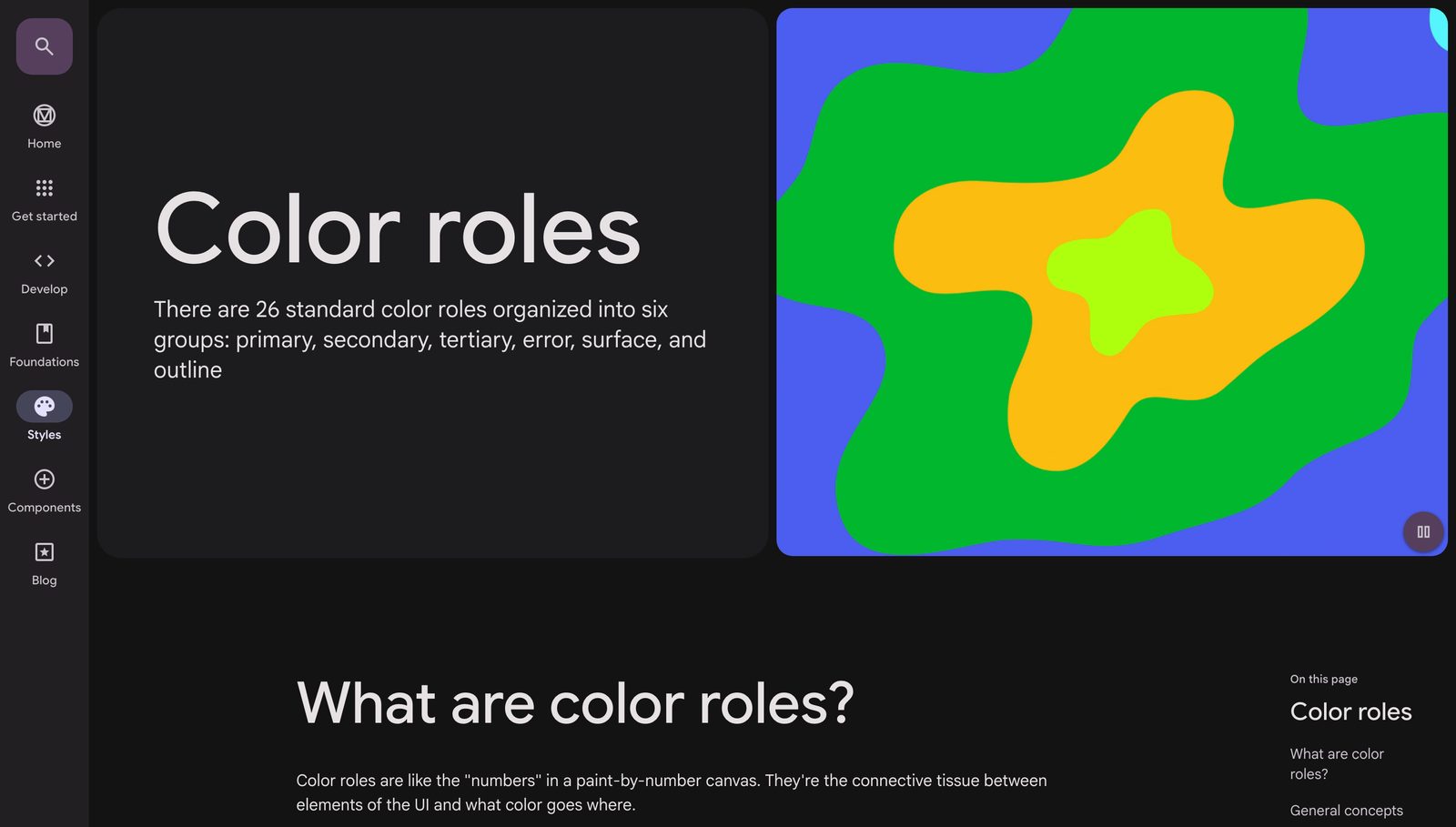
Here is the payoff moment, and it tests everything in Stage 2. Take the pricing page you built in Northwind, select it, and switch the mode to Northwind Studio. If Stage 2 was done correctly, the entire page re-brands in one action: buttons change fill, cards change radius, headings change type, and nothing breaks. This is Frost’s promise made literal, a theme is just a different set of semantic tokens pointing at different primitives, and it is the moment a client stops asking why they are paying for tokens.
But do not declare victory yet. This is where you go hunting for the components a mode swap cannot fix. Perez-Cruz’s lesson on expression is that brands differ in values and sometimes in levers too, the structural moves available to them, and some of those levers change the anatomy of a component rather than its skin. Northwind Studio may want its plan cards stacked vertically with the recommended plan pulled out into a hero, where Northwind lists them in a tidy row. That is not a token difference. That is structural divergence.
Flag structural-divergence components explicitly. This is the Harry’s Forge lesson: some components need per-brand structure, not just token swaps. Harry’s cart is a popup in one brand and a sidebar in another, composed from the same sub-components. When you find one on the pricing page, do not force it through the mode mechanism. Compose it per brand from shared functional sub-parts, and note it as a known exception. Most of the page rides the modes. A named few do not, and pretending otherwise is how multi-brand systems rot.
Stage 4 · Ship the tokens through the pipeline
The system now lives in Figma, but Figma is not where code reads it. Stage 4 makes the tokens portable, and it is Lecture 8’s pipeline, run thin.
Export the token collections from Figma as DTCG JSON, the stable W3C Design Tokens format: each token a $type and a $value, semantic tokens carrying alias references rather than resolved hex. Run that JSON through Style Dictionary, which transforms the one source of truth into whatever the two brands’ codebases consume: CSS custom properties, a Tailwind config, iOS constants, whatever the target is. One Northwind Studio mode swap in Figma becomes one theme class in production, automatically.
Two things earn their keep here. First, keep the pipeline thin: prove one button re-brands across both brands through the full chain before you scale the token set, exactly as you proved the mode swap in Figma. Second, remember the commercial point from Lecture 2: a DTCG file is not locked to Figma or to you. Northwind owns a portable asset rather than a dependency on your agency. When you hand over DTCG, you hand over a deliverable, not a lock-in.
Stage 5 · Make one component agent-legible
Now the agentic layer, Lecture 9. The bet is simple: if an AI coding agent can be told “build a Northwind Studio pricing card” and it reaches for your button rather than inventing one, adoption stops depending on humans remembering the system exists. But an agent only reuses what it can find and understand.
Make the one button you built agent-legible in two moves. First, Code Connect: map the Figma component to its real code snippet, so that when an agent pulls design context it gets your actual, token-bound implementation instead of a guess. Second, an AGENTS.md at the repo root that states the rules in plain language: use semantic tokens never primitives, import the shared button rather than styling a new one, respect the brandable-versus-constant contract, switch brand by theme not by hard-coded colour.
Calibrate the expectation. With Code Connect plus a clear AGENTS.md, expect an agent to produce system-correct component code in the 70 to 90 percent range, not 100. It will get the token bindings and the right component most of the time; you will still review and correct the edges. The agentic layer is a force multiplier on a good system, not a replacement for one. Feed it a system bound to primitives and it faithfully reproduces your drift.
Stage 6 · Make it survive: docs, governance, adoption
A system that works the day you leave but not the month after is a graveyard on a delay. Stage 6 is Lectures 10 and 11, the practices that keep the patterns alive.
Docs that lead with results. Following Mall’s evangelism doctrine, the reference site leads with the assembled pricing page in both brands rather than a bin of raw components. Show what can be built. Each component still gets Kholmatova’s three-question minimum: what is it, what is it for, how does it achieve its purpose. Purpose over property lists.
A governance contract. Borrow from NLDS and Mall. The centre (you, then whoever inherits the system) owns the token contracts, accessibility, and shared behaviour; each brand owns only its token values. Set the promotion rule: a component enters the shared canon only when three or more surfaces need it now, not someday (Curtis and Mall agree here). Install the cadence before you go, with flow weeks where product teams build from existing parts, then a systems week where the system owner audits what recurred and abstracts it. And keep Mall’s job split: product teams create, the system team collects and abstracts, and contribution is never the product team’s burden. A component maturity ladder (NLDS’s estafettemodel: candidate to hall of fame) tells everyone what is safe to build on.
An adoption metric, not a coverage metric. Define success as Mall does: adoption, phrased for people. Not “we shipped thirty components” but “the Northwind Studio pricing page shipped a week faster, on the shared button, and both brands’ pricing pages now re-skin from one token change.” Aim over time for the 80/20 target, with most of any page built from the system and the remaining slice left free for the invention that makes each brand sing.
Success criteria: the checklist
✓ Did the capstone actually produce a system, not inventory?
- Extracted, not pre-built. The system came out of a real pricing page, not a speculative library. (Mall)
- Seam is clean. Every element is sorted functional versus perceptual; functional parts are shared and purpose-named. (Kholmatova)
- Nothing binds to a primitive. Every component reads semantic tokens only; the palette is hidden. (Curtis, Frost, Polaris)
- One action re-brands the page. Switching the mode themes the whole pricing page; brand switch, light/dark and density all ride the one mechanism. (Frost, Carbon)
- Structural exceptions are named. Components that need per-brand anatomy are flagged and composed, not forced through modes. (Harry’s Forge, Perez-Cruz)
- Constants are locked. Feedback colour, focus ring and WCAG-critical contrast cannot be brand-overridden. (Jina Anne)
- Tokens are portable. DTCG out of Figma, Style Dictionary into both codebases; the client owns the asset. (DTCG pipeline)
- One component is agent-legible. Code Connect plus AGENTS.md; expect 70 to 90 percent correct generation. (Agentic layer)
- It survives you. Docs lead with results, a promotion rule and systems-week cadence are installed, success is measured as adoption. (Mall, NLDS)
The panel, mapped across the build
The point of the course was never one authority. It was knowing when each one is right. Here is the whole panel placed across the six stages.
| Stage | Authority in charge | The move they own |
|---|---|---|
| 0 · The charge | Mall | Extract from a pilot; never build the system first |
| 1 · Frame it | Kholmatova · Alexander · Curtis | Inventory by purpose, functional/perceptual split, name by purpose |
| 2 · Tokens + one component | Curtis · Frost · Jina · Salesforce | Options vs decisions, three tiers, brandable/constant, bind to semantic |
| 3 · Prove multi-brand | Frost · Carbon · Perez-Cruz · Harry’s | Mode swap themes the page; flag structural divergence |
| 4 · Ship the tokens | DTCG · Style Dictionary | Portable JSON, transformed per platform, client-owned |
| 5 · Agent-legible | Agentic layer | Code Connect + AGENTS.md; 70–90% generation |
| 6 · Survive | Mall · Kholmatova · NLDS | Results-first docs, governance contract, adoption metric |
Look at the shape of the disagreements resolved along the way. Mall says pilot-first, Frost says the token architecture is global and layered; both are true, because you extract the pilot but you extract it into the three-tier structure. Curtis says promote locally at three uses, Mall says the system team abstracts; both are true, because the trigger (three uses) and the owner (system team) answer different questions. Kholmatova supplies the why and the seam, Mall supplies the how and the when. You did not pick a winner. You sequenced them.
A design system is not built, it is extracted: make one real thing, draw the functional/perceptual seam, bind everything to semantic tokens, prove a second brand by switching a mode, ship it portable and agent-legible, and install the practices that let it outlive you.