By now you can defend the token mental model in the abstract: an option is a raw value, a decision applies it to a context, and a theme is a re-point of the decision layer. That is Nathan Curtis on a whiteboard. What that model leaves open is the part that decides whether any of it survives production: what is the actual Figma object that carries a token, and how do you flip an entire brand or theme in one click? The answer, since 2023 and refined heavily through Schema 2025, is Figma variables, organised into collections, switched by modes. When this layer is right, everything downstream (components, multi-brand, the code pipeline) follows from it. When it is wrong, you have a beautiful file that cannot theme.
Variables are the object that carries a token
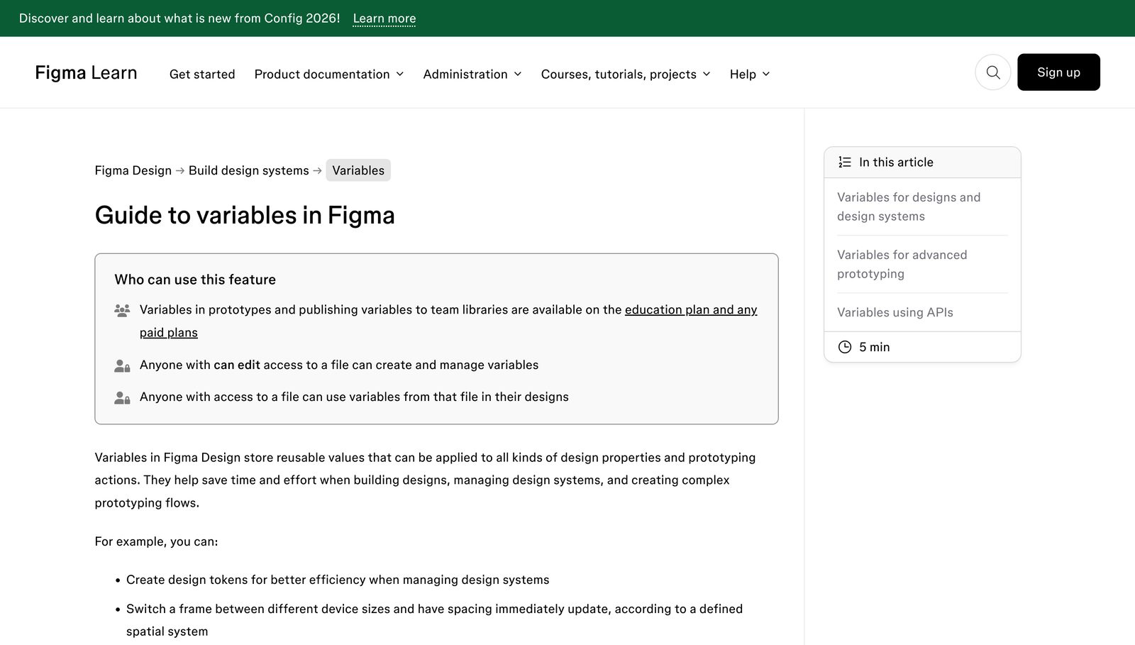
Before variables, Figma had only styles: a colour style, a text style, an effect style. A style is a saved bundle of raw properties you apply by name. It works, but for token work it has one limitation that most of this lecture comes back to. A variable is a different kind of object: a single named value that can hold one value per mode, and that can point at another variable instead of a raw value. That pointing is called aliasing, and it is why the token system lives in variables and not in styles.
Figma exposes exactly four variable types. Knowing what each one can and cannot hold is what separates a clean system from a leaky one.
| Type | Holds | Typical token duty |
|---|---|---|
| Color | A solid colour value | Every solid colour token: fills, strokes, effect colours. The bulk of a theme. |
| Number (float) | Any numeric value | Spacing, radius, sizing, opacity, font size, line height, letter spacing, stroke weight. |
| String | Text | Text content, and since April 2024 font family and font style. |
| Boolean | true / false | Layer visibility, and prototype conditional logic. |
That is the whole taxonomy. There is no “gradient variable,” no “shadow variable,” no “typography-style variable” that bundles size, weight and family into one object. Those gaps are deliberate, and they mark the boundary between what variables own and what styles must still own, which we return to below. Source: Figma’s variable-types documentation (help.figma.com/hc/en-us/articles/15339657135383), current to the 2026 feature state.
Collections are the home of modes
A single variable does not float free. It lives inside a collection, and the theming power sits at the collection level, because a collection owns its modes. A mode is a column of values. Add a second mode to a collection and every variable in it gains a second value; switch the mode on a frame and every bound property re-reads its column at once. Light and Dark are two modes of one collection. Brand A and Brand B are two modes of one collection. RAI’s school themes are ten modes of one collection. This is IBM Carbon’s “themes as modes” bet from Lecture 2, now a native Figma feature rather than a plugin.
Here is the shift to make: you do not theme by duplicating files or maintaining parallel colour styles. You theme by adding a column to a collection. One source of structure, N columns of values, one dropdown to switch. The token model promised decisions in one place flowing outward, and that is what a mode delivers in the file.
The mode-limit change that breaks old tutorials
Of everything in the tutorial ecosystem, this is the fact most likely to be stale, and it hits multi-brand work directly, so it gets its own callout. For years the ceiling was four modes per collection, and thousands of blog posts, courses and Stack Overflow answers still state “Figma allows a maximum of 4 modes.” That number is dead.
The mode limit changed on 28 October 2025 (Schema 2025). Starter stays at 1 (no modes). Professional went from 4 to 10. Organization went from 4 to 20. Enterprise is now unlimited via Extended Collections. Any resource claiming “4 modes max” predates this change and is wrong. A ten-theme system like RAI’s school modes needs exactly the new Professional ceiling of 10 and was simply not buildable as one collection before October 2025. Source: help.figma.com/hc/en-us/articles/35794667554839 and figma.com/blog/schema-2025-design-systems-recap.
The history matters because when a client or a junior designer tells you “we can only have four brands in Figma so we need separate files,” they are quoting a pre-2025 constraint as if it were current, and they will architect the whole system around a limitation that no longer exists. Knowing the exact date and the new numbers is what lets you overrule that with authority.
Aliasing: the reason it is variables, not styles
This is the architectural heart of the lecture. A variable can alias another variable of the same type. A colour variable can point at another colour variable; a number variable at another number variable. That is what lets you build the chain Lecture 2 described in the abstract:
color-action-bg (semantic) aliases blue-600 (primitive), and a button’s fill binds to color-action-bg. Re-point the semantic alias and every button moves. This is Curtis’s option-to-decision arrow, made real in the file.
Now the contrast that matters. Styles cannot alias. A colour style stores a raw value; it cannot say “I am whatever that other style is,” and it cannot reference a variable as its definition. So a style system is flat: every style is an independent leaf, with no primitive-to-semantic-to-component chain to propagate a change through. You could have a hundred colour styles and changing your brand blue still means editing every one that happened to use it. That flatness is why the token system had to move into variables the moment Figma shipped them, and why every serious 2026 system treats styles as a legacy or wrapper layer rather than the token layer. When someone asks “why variables instead of the styles we already had,” the answer is aliasing, and the consequence is propagation.
Mapping the token tiers onto collections
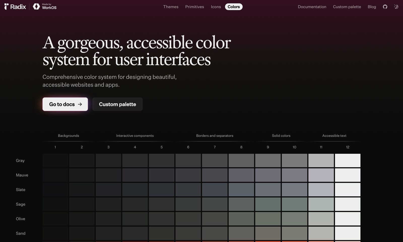
Lecture 2 gave you three token tiers: primitives (options), semantic (decisions), and optional component tokens. Here is how those tiers become real Figma structure, and the binding discipline that keeps the whole thing themeable.
| Tier | Figma home | Published? | What binds to it |
|---|---|---|---|
Primitives (blue-600, space-4) | A primitives collection, usually one mode | Hidden from consumers | Only semantic variables alias these. Components never touch them. |
Semantic (color-action-bg) | A semantic collection carrying the theme/brand modes | Published as the public API | Components bind here, and only here. |
Component (button-radius) | An optional component collection | Optional | A specific component, when it genuinely needs its own token. Aliases semantic. |
The key rule is in the last column: components bind only to semantic variables, never to primitives. A button wired straight to blue-600 is the number-one drift source from Lecture 2’s pitfalls, and in Figma it shows up as a button that will not change when you switch the brand mode, because it never subscribed to the semantic layer that carries the modes. The primitives are hidden on purpose so a consumer physically cannot reach past the semantic API and re-create that mistake. This is Atlassian’s “semantic tokens are the only public API” discipline, enforced by what you publish.
One practical consequence for multi-brand: the modes live on the semantic collection, because the semantic layer is what a brand overrides. Primitives are usually a single mode (the raw palette rarely needs a brand column of its own), and each brand mode re-aliases the semantic variables to whichever primitives that brand uses. Structure once, re-point per mode.
What variables own, and what still must be a style
Because the taxonomy is only four types, some things you might expect to tokenise cannot be a variable in 2026, and getting this wrong is a common source of a half-tokenised file. The boundary is worth knowing precisely.
| Variables own (bind these) | Styles still required for |
|---|---|
| All solid colour tokens (fills, strokes, effect colours) | Gradients as a token. A variable can drive an individual gradient stop, but the gradient itself is not a variable. |
| Spacing, sizing, radius, gap, opacity, stroke weight | Effect styles: drop shadows, inner shadows, layer/background blur, and any composite of them. |
| Typography numbers: size, line height, letter spacing | Image and video fills, and blend modes. |
| Font family and font style (string, since Apr 2024) | Multi-fill stacks (a layer with several stacked fills). |
| Boolean layer visibility and prototype state | Complex text styles, useful as composition wrappers. |
The 2026 best practice reconciles the two cleanly: variables carry every token value; styles become thin composition wrappers that reference variables. A well-built text style in 2026 stores no raw numbers. It binds its size, line height, family and style to variables, so the style is just a named bundle pointing at the token layer. Gradients and effects stay style-only at the token level, but even there you push their colour stops onto variables where you can. Aim for a file where no raw value exists anywhere except inside a primitive variable.
Typography variables: the second stale claim
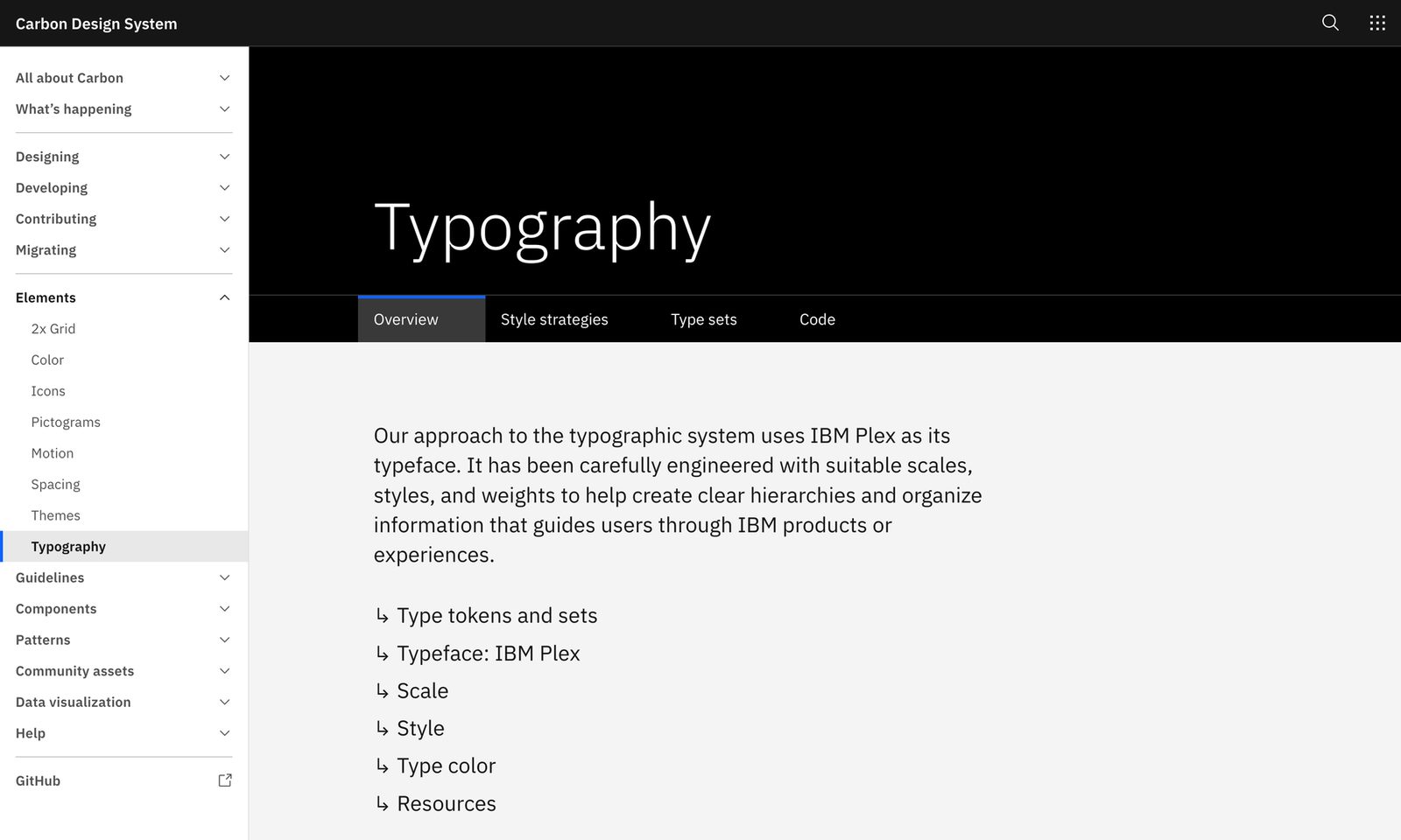
A stubborn myth says font family cannot be tokenised in Figma, so brand fonts must be hard-coded or swapped by hand. That was true until April 2024, and it is false now. Font family is a string variable scoped to FONT_FAMILY; font style is a string; size, line height and letter spacing are number variables. A text style can bind all of them, which is how a single “Display / L” style can render in a different typeface per brand mode with no duplicate styles.
One caveat that bites in practice: at launch, percentage-based line height and letter spacing, and “auto” line height, could not be bound to variables. Plan type tokens in absolute units where you need them themeable. Still, the headline holds: a tutorial that says “font family cannot be a variable” is pre-April-2024 and wrong.
Scoping: discipline against the wrong suggestions
Left unscoped, every colour variable appears in every colour picker, so a designer reaching for a stroke colour is offered your entire palette, including tokens that were only ever meant for fills. Scoping restricts which properties a variable is offered for. A brand colour can be scoped to fills only (ALL_FILLS) so it never surfaces as a shadow colour; a radius number scoped to CORNER_RADIUS so it never appears as a gap. Colour scopes include ALL_FILLS, STROKE_COLOR, EFFECT_COLOR; number scopes include CORNER_RADIUS, GAP, FONT_SIZE, LINE_HEIGHT; strings carry FONT_FAMILY and FONT_STYLE.
Scoping is not cosmetic tidiness. It makes the correct token the only token on offer at the moment of choice, which is the best guard against a designer hard-coding the wrong value because the right one was buried in a list of two hundred. Treat it as part of naming discipline, not an afterthought.
✕ The three outdated-tutorial danger zones
- “4 modes max.” The limit changed on 28 Oct 2025: Professional 10, Organization 20, Enterprise unlimited via Extended Collections. Any course still teaching four is pre-Schema-2025 and will make you split into needless files.
- Simplified instances. This component behaviour is deprecated 23 March 2026; after that date all properties and layers show by default. Audit any library that relies on simplified-instance hiding. (Detail belongs to Lecture 5, but the deprecation date is the point.)
- “Font family cannot be tokenised.” False since April 2024: string variable,
FONT_FAMILYscope, bindable in text styles. Any tutorial saying otherwise predates the feature.
The decisions panel: how to architect it
Three questions decide the shape of your variable layer, and none has a universal answer. Here is how to reason about each with the 2026 facts in hand.
How many collections? The floor is two: a hidden primitives collection and a published semantic collection, mirroring Lecture 2’s two-tier floor. Add a component-token collection only when a component genuinely needs a token that differs from the global semantic value. Resist creating a collection per category (colour, spacing, type) out of reflex. Collections exist to group things that share a set of modes, so let the mode structure drive how you split them, not the property category.
Modes versus separate libraries? With the post-October-2025 limits, most multi-brand and multi-theme work that used to demand separate files now fits inside modes of one semantic collection: up to 10 on Professional, 20 on Organization. Reach for separate libraries only when brands diverge structurally (different components, different naming, different governance owners), not merely in values. Modes handle differences in values; libraries handle differences in structure.
When to use Extended Collections? Extended Collections is the Enterprise, Figma-native theme-inheritance feature (shipped November 2025). A core team publishes a base collection; brand teams override only specific tokens and inherit the rest, and updates to the base propagate automatically to every brand. Before this, that inheritance was only achievable through third-party plugins. Use it when you have many brands maintained by different teams who must stay in sync with a central baseline, and unlimited modes, on Enterprise. For a single team maintaining a handful of brands, modes in one collection are simpler and enough.
One more 2026 fact that changes the business conversation: native Variables JSON import/export shipped in November 2025, aligned to the W3C DTCG format. You can round-trip your entire variable layer to code without a third-party plugin. That is the bridge from this lecture into the token pipeline in Tier III, and the reason what you build here is a portable asset rather than a Figma-locked one.
Tokens become real in Figma as variables (four types) that alias up the tiers and live in collections whose modes are your themes; styles cannot alias, so they can only wrap variables, never replace them, and components bind to the published semantic layer alone.