Most people build a Figma component the way they draw a picture: they place rectangles and text until the pixels look right, then right-click and choose Create Component. That produces something that looks like a button. It does not produce a button that a team of forty people, a codebase, and an AI agent can all use without argument. What separates a hobbyist library from a production design system is easy to state and hard to live by: a component is a small API, not a drawing. Its outer surface, the set of knobs you can turn from the outside, is a contract. This whole lecture is about designing that surface deliberately.
Nathan Curtis and the Figma docs call the knobs properties. Godbolt, in his framing of a component API, treats a component as having four pillars: its anatomy (the parts it is made of), its options (the ways it can vary), its behaviour (how it responds to interaction and content), and its states (the discrete conditions it can be in). Those four pillars map almost one-to-one onto the property types Figma gives you, and onto the props your engineers will type in code.
Treat states as a contract with engineering. Every state you draw is a state someone has to build, test, and keep working. If it exists in the design and not the code, it is a bug waiting to be filed; if it exists in the code and not the design, it is a surprise. The component API is where the two disciplines agree on exactly how many things this thing can be.
Nathan GodboltOn the component API and its four pillarsThe four property types, and when to reach for each
Figma gives you exactly four component property types. Choosing the right one is the most consequential architectural decision you make per component, because the wrong choice is what produces the unmaintainable libraries you will inherit from clients. Here they are, with the current 2026 behaviour and the rule for each.
| Property type | What it does | Reach for it when… |
|---|---|---|
| Variant | Switches between members of a component set (a Property=Value combination) | The difference is structural or is a discrete state the whole component snaps between: Size, Emphasis, State |
| Boolean | Shows or hides a single layer only | A binary presence toggle: a leading icon, a badge, a helper line. Never double your variants for an on/off |
| Instance swap | Swaps a nested instance for another component; supports preferred values | A slot for an interchangeable child: which icon, which avatar. Curate preferred values so users pick from the right shortlist |
| Text | Edits a text layer from the properties panel (plain text; no rich text) | Content that changes per use: the label, the count, the helper copy |
One line organises all four: variants are for structure, properties are for content and state. A Variant reshapes what the component is; Boolean, Instance-swap and Text change what it carries. Get that backwards and you get variant explosion, which is the disease this lecture exists to cure.
Variant explosion, and how to cut it
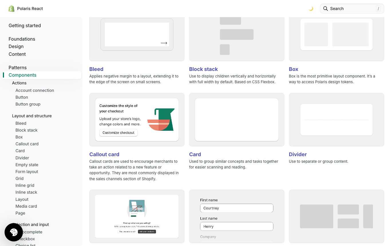
Variant explosion is the combinatorial blow-up you get when you express every dimension of a component as a variant. The maths is unforgiving: variants multiply. Suppose a button has four honest dimensions.
| Dimension | Values | If modelled as a variant |
|---|---|---|
| Size | Small, Medium, Large | × 3 |
| Emphasis | Primary, Secondary, Tertiary | × 3 |
| State | Default, Hover, Pressed, Disabled | × 4 |
| Icon | Present, Absent | × 2 |
Model all four as variants and you get 3 × 3 × 4 × 2 = 72 variants in a single set. Every one is a frame you draw by hand, every one drifts, and adding a fifth emphasis level means editing 24 frames. Now apply the rule. Icon presence is binary, so it is a Boolean, not a variant. That collapses the set from 72 to 36. Then curate which icon with an Instance-swap property and a text label with a Text property; neither adds a variant. You are left with the three dimensions that genuinely reshape the component or snap it into a discrete condition:
Size (3) × Emphasis (3) × State (4) = 36 variants, plus one Boolean, one Instance-swap, one Text property. Half the frames, and the icon, its choice and the label are now editable from the panel without hunting through the set. The rule to work by: keep as variants only the dimensions that are structural or that the component discretely snaps between; push everything else onto Boolean, Instance-swap and Text. A quick gut check: a true on/off is a Boolean; a curated pick-one is an Instance-swap; free content is Text; only what is left belongs in the variant matrix.
Why keep State as a variant at all, when hover looks like a Boolean? Because a state is not a layer toggle. Godbolt: states are a contract. Modelling Default / Hover / Pressed / Disabled as explicit variants makes each state a named, reviewable, buildable thing that maps one-to-one to the :hover, :active and disabled conditions engineering has to ship. A hidden layer cannot carry that meaning across the design-to-code seam.
Nested instances and exposing properties
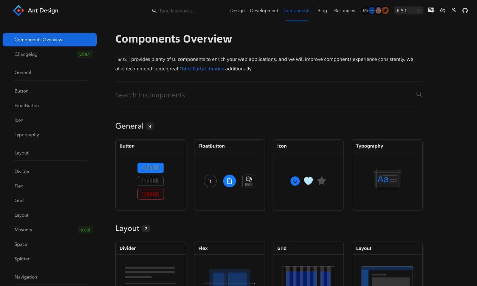
Real components are built from other components. A Card contains a Button; the Button contains an Icon. Those are nested instances, and by default their properties are buried: to change the Card's button label you would have to click down into the nesting. Figma's answer is expose nested instances, which surfaces a nested component's properties on the parent's own properties panel, so the Card exposes the Button's Label and Emphasis at the top level.
One current constraint to design around: exposing is all-or-nothing per nested instance. You cannot surface a subset of a nested component's properties; expose it and every one of its props comes up to the parent. So clean nested components make clean parents. If a nested Button has a bloated, undisciplined property set, that mess propagates upward the instant you expose it. Architect the leaves before you compose the branches.
Slots: React children, in Figma
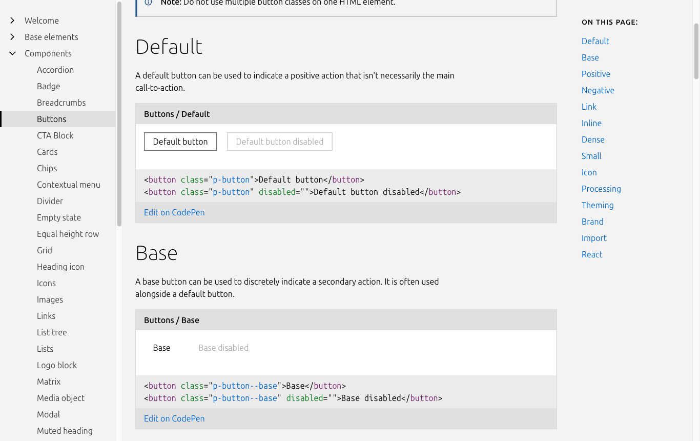
Instance-swap lets a user swap one nested instance for another, but the shape is fixed: one slot, one child. Sometimes a component needs a region where designers can freely add and arrange arbitrary content without detaching the instance: a card body that might hold a paragraph, or an image and two buttons, or a list. That is what Slots are, shipped on the GA path from Schema 2025. You convert a nested frame into a slot, and designers can then drop whatever layers they like into it while the component stays an instance.
A slot is the Figma equivalent of React children: a flexible content region a component hands to its consumer, instead of dictating every layer itself.
FigmaSlots, Schema 2025 feature setThe constraint to keep in mind: properties cannot apply to layers inside a slot. The slot is a hole in your API on purpose; the component controls the frame around the hole, not the contents. Use Instance-swap when the child is one of a known, curated set (which icon), and a Slot when the content is genuinely open-ended (whatever goes in this card body). Slots are available on all plans.
Simplified instances are deprecated as of 23 March 2026. Older libraries used simplified-instance mode to hide properties and layers from consumers. After that date, all props and layers show by default. If you inherit a library built before this, audit it: components that quietly relied on hidden props will now expose them, and any tutorial that teaches simplified-instance hiding is out of date.
Designing the component API
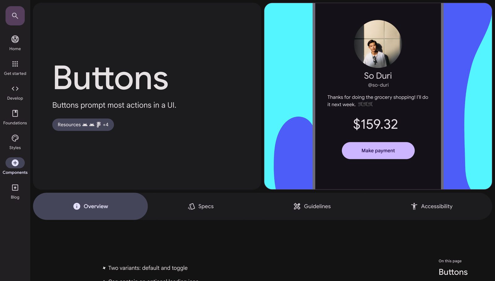
Here is the discipline that ties it together. Design the component's outer surface as though an engineer and an agent will read it, because they will.
- States are explicit variants. Default, Hover, Pressed, Focus, Disabled, Loading, Error. Draw each one you intend to ship, and only those. This is Godbolt's states-as-contract made literal in the file.
- Props map one-to-one to code. A Figma property should correspond to a real prop on the coded component. If your Figma Button has
Emphasisand your React Button hasvariant, you have a translation tax on every handoff. Name and shape them to match. - Use PascalCase for Code Connect. Code Connect maps Figma components to real code components and shows engineers the true import path and usage in Dev Mode. Naming components in PascalCase (
ButtonGroup, notbutton group) makes that mapping clean and matches component naming conventions in the code. - Sizing modes are signals. Hug, Fill and Fixed do more than lay things out; they communicate intent. A Fill-width button says “I stretch to my container”, which an engineer reads as
width:100%. Set them deliberately, because they are read as behaviour. - Bind to semantic tokens, never primitives. A component's fill should reference
color/action/primary, notblue/600. Bind to the semantic layer and the same component recolours correctly across every brand and mode you built in Lecture 4. Bind to a primitive and you have hard-coded one brand into the component for good.
The panel: Frost's atoms-up vs Kholmatova's purpose-first
How granular should a component be, and how do you decide what is a component at all? Two authorities pull in different directions, and the tension is useful.
Brad Frost builds bottom-up by complexity: atoms combine into molecules, molecules into organisms, on up to templates and pages. It is a clean mental model and it gives most teams the vocabulary they actually speak. Alla Kholmatova is sceptical of applying that hierarchy off the shelf, and she has the receipts. At FutureLearn her team tried atomic design and found the middle layers did not earn their keep:
We spent far too much time debating whether something was a molecule or an organism. Since the team didn't see enough distinction between the two types, they were merged together. We ended up with two levels of hierarchy: atoms and molecules.
Alla Kholmatova“Design Systems”, Chapter 10: on atomic designHer conclusion is pragmatic, not doctrinaire: “atomic design (or any other methodology) might not be right for you right out of the box,” though she grants that “separating granular elements from more complex ones makes sense, both in the pattern library and in the code.” Her deeper move is to name components by purpose, not appearance. To find the purpose, describe what a pattern does with a verb, not what it looks like: a promotional module became “Billboard” (promote a course, discover a course), not “Image header.” A presentational name confines a component to its style, in her words, “a ‘pink’ button can only be pink.”
Reconcile them like this: use Frost's granularity as a loose ladder, not a law, and let purpose decide where you stop. If your team cannot tell a molecule from an organism, merge them, as FutureLearn did. Name every component for the behaviour it enables. Frost tells you how small the pieces can go; Kholmatova tells you which pieces are worth naming and where to stop. In practice you lean on Frost for the ladder and Kholmatova for the labels.
Agent-legibility: the new consumer of your API
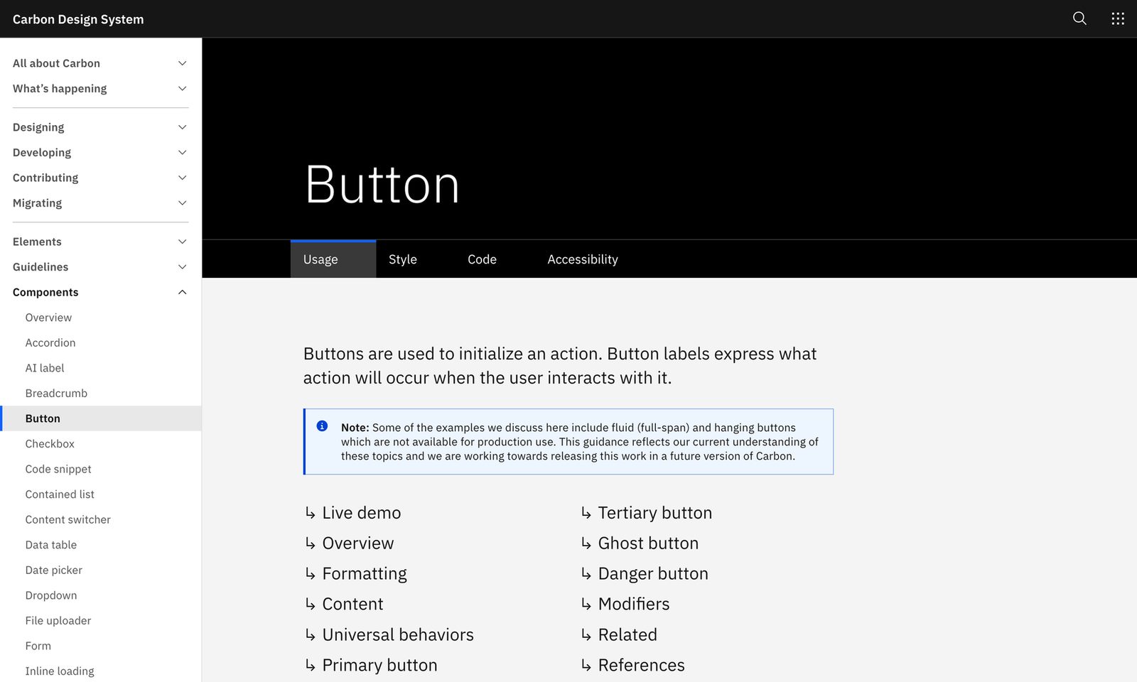
There is now a third consumer of the component API besides designers and developers: the AI agent. The Dev Mode MCP server exposes your component and variable metadata, screenshots and code representations to agents, and when Code Connect is present it returns the real import path. That changes how a well-designed API pays off. A component whose states are explicit variants, whose props are named to match code, whose fills bind to semantic tokens, and whose parts are labelled by purpose is legible to a machine: the agent can read what it is, how many states it has, and how to import it. A component that is a pile of ambiguously named layers with hidden properties and primitive fills is as opaque to the agent as it is to a new hire. The discipline that made your library human-friendly is the same discipline that makes it agent-friendly, so there is no extra work to do.
Pitfalls
- Modelling binary toggles as variants. Icon on/off, badge on/off. Each one doubles your set. They are Booleans. This is the number-one cause of the 200-variant button you will inherit.
- Hiding states in hidden layers. A hover expressed as a toggled layer is invisible to the review, to the code map, and to the agent. States are explicit variants because states are a contract.
- Binding components to primitive tokens. A fill wired to
blue/600hard-codes one brand. Bind tocolor/action/primaryso the component themes across brands and modes. - Exposing a messy nested instance. Exposing is all-or-nothing, so a bloated nested Button dumps its whole mess onto the parent. Fix the leaf first.
- Using an Instance-swap where you needed a Slot. One curated child versus open-ended content are different problems. Swap for a known shortlist; Slot for “whatever the designer puts here.”
- Relying on simplified instances. Deprecated 23 March 2026. Audit any inherited library that hid props this way.
- Naming by appearance. “BlueCardLarge” confines the component to its look and breaks the code map. Name by purpose in PascalCase.
A component is a small API: keep only structural or discretely-switched dimensions as variants, push everything else to Boolean, Instance-swap, Text and Slots, name by purpose in PascalCase, and bind to semantic tokens, so the same surface reads cleanly to designers, engineers and agents alike.