
By this point in the course you have variables that carry your token values and components with clean property sets. Auto layout is the third leg. A component whose values are tokenized but whose structure is a loose bag of absolutely positioned layers is not a system component; it is a picture of one. When a label grows, it clips. When you swap to a denser brand mode, nothing reflows. When Dev Mode or an agent tries to read it, the output is meaningless. Auto layout turns a static drawing into a responsive rule, and in 2026 it is also the biggest single factor in whether the code Figma generates from your file is usable or worthless.
One framing runs through the whole lecture: auto layout maps one-to-one onto CSS flexbox. A horizontal auto layout frame is a display:flex; flex-direction:row container. A vertical one is flex-direction:column. Gap is gap. Padding is padding. This is not a loose analogy; it is close enough to a literal translation that the Dev Mode and MCP code representations of a well-built auto layout frame are the flex code a front-end engineer would have written anyway. Everything below follows from that equivalence.
The flows: horizontal, vertical, wrap, and the new grid
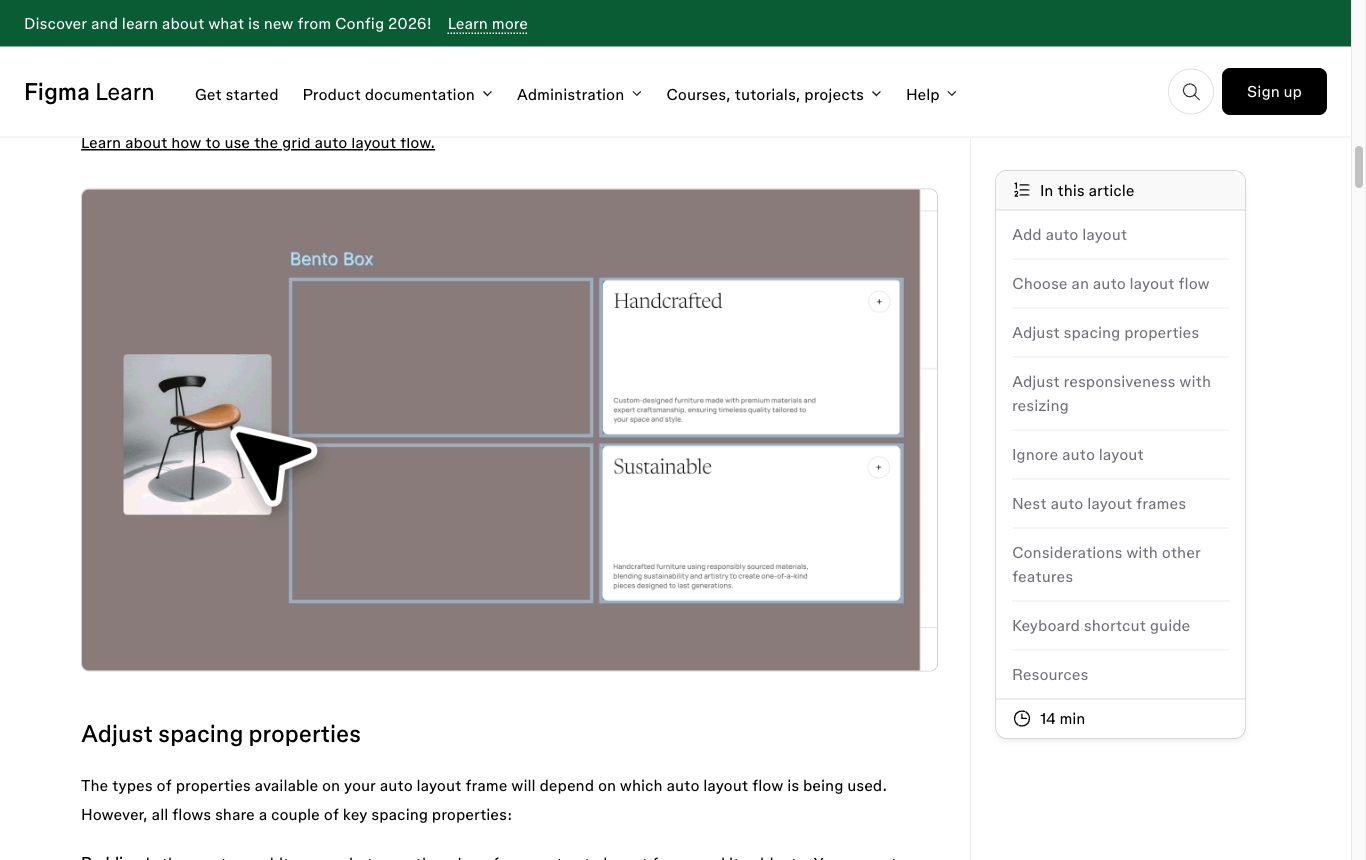
An auto layout frame has a flow, and as of the 2026 feature state there are four to choose from.
Horizontal and vertical are the originals: children lay out in a single row or a single column, spaced by the frame’s gap, inset by its padding. These are pure flex. A toolbar, a button’s icon-plus-label, a form field stack: all single-axis flows.
Wrap lets a horizontal flow break onto multiple lines when it runs out of width, which is exactly CSS flex-wrap: wrap. Use it for tag clouds, chip groups, gallery thumbnails, any collection whose item count you do not control and whose line count should follow the container width rather than a fixed column count.
Grid is the newest flow, shipped in beta at Config 2025 (May 2025). It is a two-dimensional, CSS-grid-like layout with fr tracks and cell spanning: you define rows and columns and place children into cells, and a child can span multiple cells. It is the right tool for genuinely two-dimensional structures such as a pricing table, a dashboard of cards, or a bento layout, where wrap’s one-line-at-a-time model cannot express the alignment you need across both axes.
Grid is powerful but young, and it is not real CSS Grid. Before you reach for it, read the pitfalls section below. For most component work, single-axis horizontal and vertical flows remain the workhorses, and the discipline of nesting them correctly matters more than any exotic flow.
Sizing: Fill, Hug, Fixed, and their CSS meaning
Every auto layout frame and every child inside one carries a resizing setting on each axis, and this is where most of the craft lives. There are three values, each mapping to a specific CSS behaviour. Once this table is second nature, you can predict both how a frame reflows and what code it emits.
| Figma resizing | What it does | CSS equivalent |
|---|---|---|
| Hug contents | The frame shrinks to exactly fit its children plus padding. Only available on auto layout frames. | width: fit-content (the flex container sized to its content) |
| Fill container | The child grows to consume the free space on that axis of its parent. Only available on a child inside an auto layout frame. | flex-grow: 1 / flex: 1 (or align-self: stretch on the cross axis) |
| Fixed | The dimension is pinned to an explicit pixel value and does not react to content or container. | width: 320px (a hard value) |
Read a real component through this lens. A button is a horizontal auto layout frame. Its width hugs its contents, so the button is exactly as wide as its icon, gap and label demand. The label text inside is hug on width too, letting the button grow with longer copy. Now put that button in a full-width mobile action bar: switch the button’s width to fill container and it stretches edge to edge, emitting flex:1 rather than a brittle fixed width. Same component, two contexts, no detaching, no hand-drawn rectangles. That one example is the promise of auto layout: structure that expresses intent instead of freezing a single measurement.
Min and max: bounding the elastic dimensions
Hug and Fill are elastic by nature, and unbounded elasticity is its own failure mode. A Fill card that can grow forever becomes an unreadable full-width line of text on a wide screen; a Hug chip that shrinks to nothing swallows its label. The 2026 auto layout adds min and max width and height constraints on both auto layout frames and their children, which bound exactly these elastic cases. Set a max width on a Fill text column so long lines stay readable; set a min width on a Hug button so it never collapses below a tappable size. These map cleanly to CSS min-width / max-width / min-height / max-height, and they compose with Fill and Hug rather than replacing them.
One boundary to remember from the feature reference: min and max are available on horizontal, vertical and wrap auto layout, but not on Grid frames yet. It is one of several signs that Grid is still catching up to the single-axis flows.
Ignore auto layout: the deliberate escape hatch
Sometimes a child genuinely should not participate in the flow. A notification badge pinned to the corner of an avatar, a tooltip, a decorative overlay: these need to sit relative to the frame’s edges, not be spaced into the row or column. For this Figma provides Ignore auto layout, formerly called Absolute position. It removes a single child from the flow and lets you position it against the frame’s edges, which is precisely CSS position: absolute inside a positioned parent.
Treat this as an escape hatch, used deliberately for overlays and badges, not as a substitute for structure. If half your children are set to ignore auto layout, you have not built an auto layout frame; you have built a canvas with a flex wrapper around it, and the generated code will show it. Reach for Ignore auto layout for the badge, and keep everything else in flow.
Choosing the flow: a decision guide

The flows are not interchangeable, and picking the wrong one gives you structure that fights you later. Decide by the shape of the problem, not by habit.
- Use vertical or horizontal when the content lives on a single axis and you want it fully responsive to content and container. This is the default and covers the overwhelming majority of components: stacks, rows, toolbars, field groups, list items. Nest them, a vertical frame of horizontal frames, to build almost anything.
- Use Wrap when you have a one-dimensional collection of variable, unknown length that should flow onto as many lines as the width allows: chips, tags, filter pills, thumbnail galleries. You care that items pack and wrap, not that they line up into a strict grid.
- Use Grid when the layout is genuinely two-dimensional and items must align across both rows and columns simultaneously, or when a child must span multiple cells: dashboards, pricing tables, bento layouts, calendar cells. If you find yourself faking a grid with nested wraps and fixed widths, that is the signal to switch.
A quick test: if resizing the container should change how many items sit per line, you want Wrap. If resizing should stretch tracks while keeping a fixed column count and cross-axis alignment, you want Grid. If there is only ever one line, you want a plain horizontal or vertical flow.
The pitfall: Grid is not CSS Grid
Because the beta borrows CSS Grid’s vocabulary, fr tracks and spanning, it is easy to assume feature parity. It does not have it, and the gaps matter. From the 2026 feature reference, Figma’s Grid, as of this writing, cannot do the following:
Grid limits vs real CSS Grid. No percentage or auto track sizing (only fixed and fr). No placing multiple elements in a single cell. No named grid areas. No subgrid. And reordering layers in the layers panel changes only z-index, not grid placement. Min and max constraints are not yet supported on Grid frames either. Where your intent depends on any of these, you cannot express it in the Grid itself, so communicate it with annotations and dev resources that the MCP server surfaces to whoever, or whatever, builds the code.
So a Grid frame is often a strong visual approximation of the final layout but a weaker specification of it. That is fine as long as you know it and annotate the difference. It is a trap if you hand it to a developer or an agent as if it were a complete grid definition.
Why real auto layout produces real code

This is the payoff that makes the lecture a Tier II craft topic rather than a tidiness tip. Because auto layout maps one-to-one onto flexbox, a frame built with proper flows and Fill/Hug/Fixed resizing generates clean, semantic code in Dev Mode and through the MCP server. A horizontal Hug frame with a token-bound gap comes out as a flex row with a real gap value. A Fill child comes out as flex:1. The generated markup is close to what an engineer would have authored by hand, which is why an AI agent reading the file through the MCP server can produce correct components: the design already encodes the layout logic in a form that translates.
The inverse is the horror story. Take a designer who ignores auto layout and positions everything by eye, nudging elements until they look aligned. There is no flow to translate, so the generator has nothing to emit but absolute coordinates and the measured sizes of every box. You get code littered with magic numbers: w-[37px], top-[113px], ml-[6px]. That output is worthless. No engineer will keep it, no agent can generalise it, and it quietly teaches the model that your file is noise. Whether a component generates flex gap-2 or w-[37px] comes down to one thing: whether auto layout carried the structure or a mouse did.
Real auto layout is agent-legible: it maps one-to-one to CSS flex, so a well-structured frame generates the code a front-end engineer would have written. Nudged pixels have no structure to translate, so they generate magic numbers like w-[37px] that no one can use.
Figma 2026 feature stateAuto layout & Dev Mode MCP, Section 4 & 5Binding gap and padding to space tokens
The last piece closes the loop back to variables. Auto layout gives you the structure; on its own it does not give you consistency. A frame with a hand-typed gap of 12 and another with 13 will reflow correctly and still be subtly, permanently inconsistent, and their code will emit two different arbitrary values. The fix is to bind gap and padding to number variables from your spacing scale, the same space/2, space/3 tokens the rest of the system uses.
Bound spacing buys you three things at once. Every frame in the file is consistent by construction, because they all reference the same token. The frames become themeable, since a denser brand mode can remap the spacing scale and every bound frame retightens automatically. And the generated code emits named spacing utilities or CSS custom properties instead of raw pixels, which is the difference between gap: var(--space-2) and gap: 12px in the output. Figma’s early-access Check Designs linter exists to flag exactly the hard-coded gap that should have been a token. Auto layout structure plus token-bound spacing is what makes a component responsive, themeable and legible all at once, the three properties we opened with.
Auto layout is the flex skeleton of a component: pick the flow for the shape of the problem, use Fill / Hug / Fixed and min-max to express intent instead of freezing measurements, bind gap and padding to space tokens, and the file becomes responsive, themeable and agent-legible, generating real code instead of w-[37px] garbage.