Everything in this course has been building toward this file. You have the functional/perceptual split from Lecture 1, the token mental model from Lecture 2, variables and modes from Lecture 4, component architecture from Lecture 5, and auto layout from Lecture 6. Multi-brand organisation is where all of those meet a single, awkward, load-bearing question: when one design system must serve several brands, where do the brands differ, and how do you structure a Figma file so that difference is cheap to express and cheap to maintain?
It comes up constantly in serious agency and in-house platform work: a bank with retail and business apps, a media company with a dozen mastheads, a car group with a stable of marques, an events business with several show brands. Most teams start with one Figma file per brand, and most teams drown in exactly that. What follows is the seam, the three organisational schools, and the two authorities who tell you what to put on each side of the line.
The seam: functional stays shared, perceptual is where brands differ
Go back to Kholmatova’s split. It happens to be the fault line a multi-brand system is built along. Every pattern is either functional or perceptual, and the two differ in origin, not just in how they look.
Functional patterns are a bit like nouns or verbs, they are concrete, actionable parts of the interface; whereas perceptual patterns are similar to adjectives, they are descriptive. A button is a module with a clear function: allow users to submit an action. But the typographic style in the label of the button, its shape, background colour, padding, interactive states and transitions are not modules. They are styles; they describe what kind of button it is. From a front-end perspective, modules always have a basis in HTML, and perceptual patterns are typically CSS properties.
Alla Kholmatova“Design Systems”, Chapter 1: Design PatternsFunctional patterns come from the product’s domain and from user behaviours: an event card, an exhibitor list, a ticket call-to-action, a data grid, a checkout. Perceptual patterns come from the brand’s ethos: colour, typography, iconography, spacing, shape, imagery, motion, tone. Her HipChat and Slack example says most of what this lecture is about. Near-identical chat features, an entirely different feel, and all of that difference sits in the perceptual layer. Same skeleton, different skin.
That is your multi-brand seam. The functional layer is the shared infrastructure: components named by purpose, owned by the centre, identical across every brand. The perceptual layer is where brand lives: tokens, type, colour, iconography, per brand. Kholmatova says the same thing in brand terms:
Sometimes such qualities are seen as styling or the skin of a product, a layer on top. But to be effective they must live not only on the surface but at the core of the brand, and they should evolve with the product. When effective, perceptual patterns become powerful product differentiators.
Alla Kholmatova“Design Systems”, Chapter 4: Perceptual PatternsThe practical rule that falls out of the seam: name functional components by purpose, never by brand. A component called EventCard can be reskinned four ways. A component called AquaBlueCard can only ever be one thing, which is Kholmatova’s pink-button warning applied to whole components. Brand belongs in the values you bind, not in the names you assign.
The three organisational schools
Once you accept the seam, the Figma question gets concrete: how do you physically arrange collections, libraries and modes so the shared functional layer and the per-brand perceptual layer can coexist? The field has settled on three schools. None of them is universally correct. The right choice depends on your team size, brand count, and how much the brands actually share anatomically.
| School | How it works | Cost / risk |
|---|---|---|
| 1 · One library per brand | Each brand gets its own full library: components and styles duplicated per brand. | Full isolation, but N× maintenance and guaranteed drift. A fix must be made N times. Legacy except where brands share almost no anatomy. |
| 2 · Brand as a variable mode | One shared library. Brand is a mode in a variable collection; you toggle brand per frame and every bound component re-skins. | Lowest maintenance, build once. Critique: no native staging or QA of variable changes before they go live. Viable at roughly 4 to 12 brands after the 2025 mode-limit change. |
| 3 · Core library + per-brand foundation libraries | One core component library plus a separate foundation (token) library per brand, swapped in per file. | Isolation plus shared components. Native library swap does not reliably swap variables, so plugins or Figma’s Enterprise-only “extended collections” are needed. For separate brand teams, confidentiality, or 8+ brands. |
When to pick each. If the brands share most of their anatomy and one small team owns everything, go with School 2. The modes approach gives you a single source of truth and a one-click re-skin. If you have separate brand teams, confidentiality requirements between brands, or more than roughly eight brands, go with School 3, where the isolation earns back the plumbing. School 1 only survives where two brands share so little structure that calling them one system is a fiction. For the common four-to-twelve-brand case, the settled advice is layered collections everywhere (a primitives collection plus a semantic collection, with components bound only to the semantic tier), then modes for small shared-anatomy teams and library swap for large or siloed ones.
The 2025 change that made brand-as-mode viable
School 2 used to hit a hard ceiling. For years Figma capped variable modes at four per collection on every paid plan, which is why pre-2025 multi-brand articles either dismiss the modes approach or bend around it. If a mode carries a brand and you only get four of them, you have nothing left to spend on light/dark or density, and a dozen brands is out of the question.
Then that ceiling moved. At Figma’s Schema conference on 28 October 2025, the per-collection mode limits rose from four to 10 on Pro, 20 on Organization, and 40 on Enterprise, with Enterprise-only “extended collections” on top. Add typography variables from 2024, which let font-family itself become a mode-switched string, and brand-as-mode became a first-class strategy at real brand counts rather than a demo trick. So when you read an article claiming Figma only gives you four modes and brand-as-mode does not scale, check its date. That constraint expired in October 2025.
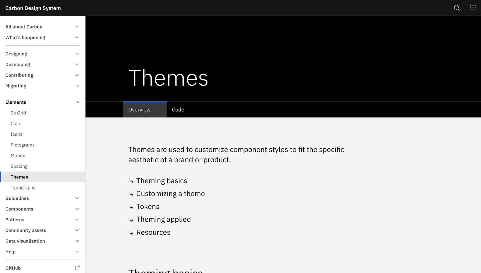
IBM Carbon is the proof of concept for School 2 at scale. Carbon v11 consolidated what had been separate theme files into four themes as variable modes inside one library (White, Gray 10, Gray 90, Gray 100), and layered a contextual layer token on top so nested surfaces resolve automatically. It validates the pattern: themes as modes, in one library, is a shipping-grade architecture, not an experiment.
Perez-Cruz: consistency is not the goal, expression is
Kholmatova gives you the seam. Yesenia Perez-Cruz tells you what to do with the perceptual side of it so your brands do not collapse into one beige average. Her book Expressive Design Systems opens from a different fear than most systems writing. Where the usual worry is inconsistency, hers is that systems get so consistent they go dead:
In this book, I'm going to describe ways you can create a design system that makes your products feel cohesive across multiple touchpoints while still leaving room for meaningful experimentation and divergence. This is what I call an expressive design system.
Yesenia Perez-Cruz“Expressive Design Systems”, A Book Apart, 2019: IntroductionShe pulls apart two words most people use loosely. Unity means all your brand elements work together as one, and a tool can deliver that: shared components, a style guide, a brand language. Cohesion is the harder quality that makes experiences understandable across the whole journey, and no tool on its own produces it. Here is her formulation, from the New York subway signage case:
Design systems create better products when they provide both unity and cohesion. Unity means that things feel complete, all of your brand elements work together as one... Cohesion is the quality that makes your user interfaces easy to understand across the experience.
Yesenia Perez-Cruz“Expressive Design Systems”, Chapter 1: Setting a PurposeFor multi-brand work the lesson is sharp. A shared component library buys you unity almost for free. It does not buy you cohesion, and it does not buy you brand. Both of those you have to design into the perceptual layer on purpose.
Big levers and small dials
Her most useful framework for a multi-brand file is how she decides where variation is allowed to happen. She frames the whole design language as a set of controls, some coarse and some fine:
To create an expressive design language, you're modulating three things: color, typography, and space. I think of these as the big levers and small dials of a design system. Changes to your color palette, typography, and spacing scale are your big levers: they broadly define the overall feel of your brand. Small dials are the individual adjustments you can make within a component.
Yesenia Perez-Cruz“Expressive Design Systems”, Chapter 3: Communicating BrandMap this straight onto your Figma structure. The big levers, colour, typography and the spacing scale, are what a brand mode or a per-brand foundation library should carry: pull the lever and the whole brand shifts. The small dials are the per-component adjustments you expose deliberately and sparingly, so a brand can tune one component without forking it. The discipline is keeping brand difference on the levers and dials you chose, rather than letting it leak into ad-hoc overrides scattered across the file.
Her deeper warning is the one that separates a real multi-brand system from a reskin. Cohesion and unity are not enough if the perceptual layer has no range:
Expressive design systems have three defining qualities... They support a range of expression. Your design system should enable meaningful experimentation and divergence while still retaining the spirit of the system writ large.
Yesenia Perez-Cruz“Expressive Design Systems”, Introduction: What Makes a Design System Expressive?The practical consequence: if you give the perceptual layer no real range, brands feel like reskins. When every brand is the same component with a different hex value swapped in, users sense the sameness even when they cannot name it. A brand needs enough room on the big levers, a distinct type voice, a genuinely different colour strategy rather than a hue rotation, its own spacing rhythm, so it reads as itself and not as a paint job over a competitor. Making that room is the design work. The file structure only holds it.
Perez-Cruz’s Vox Media case makes the point concrete. Vox built a system, later called the Chorus / Unison work, that had to serve editorially distinct brands (Vox, The Verge, Eater, SB Nation and more) from a shared foundation. The lesson she draws is not “force them to converge” but the opposite: define a shared functional core, then give each brand real expressive range on the big levers so The Verge and Eater feel like different publications, not two skins of one CMS. The shared system is what makes the variation affordable, not what suppresses it.
The Harry’s Forge lesson: some brands need different structure, not different tokens
Here is the failure mode that catches teams who over-trust the seam. The clean story says functional structure is shared and only perceptual tokens differ. That holds most of the time and breaks right where it hurts. Harry’s built a multi-brand system called The Forge to serve both Harry’s and Flamingo, and they found some components that swapping tokens could not reconcile at all.
The Forge lesson. On Harry’s the Cart was a popup; on Flamingo the same Cart was a sidebar. Same job, genuinely different anatomy. Harry’s answer was not one component with a token override, and not two unrelated components either. It was a set of flexible base primitives that each brand composes differently into its own complex component. The takeaway for your file: some components need per-brand structure, not just per-brand tokens. Plan for a small number of components where the anatomy itself diverges, built from shared sub-parts, and do not try to force them into a single variant set. Navigation is the usual first offender.
This refines the seam rather than weakening it. The functional layer is shared at the level of purpose and primitives, not always at the level of a single frozen assembly. Most components share their assembly across brands and vary only on the perceptual layer. A minority share only their primitives and their purpose, and get re-composed per brand. Knowing which is which before you build is the craft.
Case studies: how real systems hold the seam
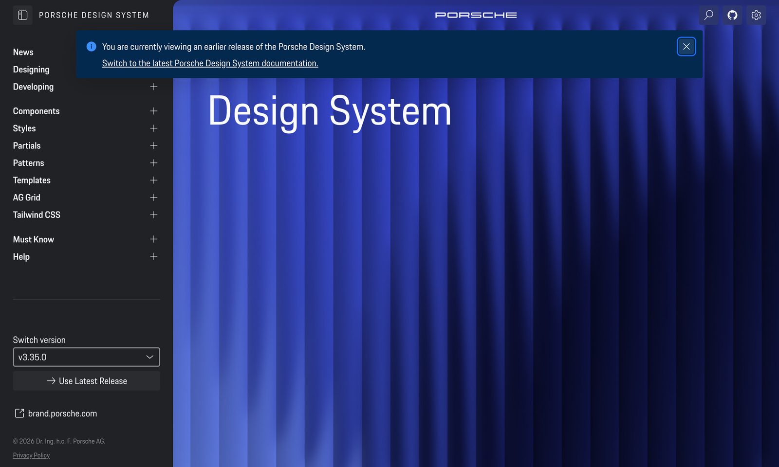
Volkswagen Group: GroupUI. The clearest large-scale instance of the shared-functional / per-brand-perceptual seam. GroupUI serves 15+ brands (Volkswagen, Audi, Škoda, Porsche, MAN, Scania and more) from one framework-agnostic component core, built as Stencil.js web components so it does not care which front-end framework a brand ships. Every brand’s identity comes entirely through design tokens, with the Figma and Sketch libraries mirroring the code. Their own positioning for the system says a lot: it sits “between standard and flexibility.” That is the seam stated as a product goal. One shared functional core, brand carried wholly by the perceptual token layer, School 2 thinking at industrial scale.
NL Design System. The governance model that makes multi-brand sustainable. NLDS serves many Dutch government organisations (Utrecht, Amsterdam, Den Haag and others) from a shared base, and it splits ownership precisely: the centre owns behaviour, accessibility and the token contracts; each organisation owns only its token values, expressed as a JSON theme that compiles to a CSS theme class. An org can change what a component looks like but not how it behaves or whether it is accessible. That is the seam written as a governance rule rather than just a file structure. Their naming convention, prefix.block.element.modifier.property (for example utrecht.button.background-color), bakes the brand prefix into the token so values never collide across organisations. Component maturity moves through their estafettemodel (relay model): Help Wanted → Community → Candidate → Hall of Fame, so a pattern earns its place in the shared core by surviving real use instead of being decreed into it. That is the answer to “who is allowed to change what” that a modes-based file cannot give you on its own.
The panel: structure, expression, and the evidence
Three voices on one seam, from three angles. Kholmatova gives you the structural line: functional patterns are the shared, purpose-named infrastructure, perceptual patterns are where brand lives, and they differ in origin, not just in looks. That tells you where to cut. She also hands you the strict-versus-loose dial from Chapter 6, where a multi-brand system is usually strict on the functional contract (behaviour, accessibility, the shape of the API) and deliberately loose on the perceptual layer so brands have room to be themselves. Perez-Cruz tells you what to do on the loose side: modulate the big levers of colour, type and space per brand, expose small dials sparingly, and give the perceptual layer genuine range, since unity and cohesion without expressive range produce reskins rather than brands. The case studies supply the proof and the two hard edges. GroupUI shows the seam works at 15+ brands when brand rides entirely on tokens. NLDS shows the governance that keeps the seam honest, with the centre owning contracts and orgs owning values. Harry’s Forge marks the boundary of the clean story, where some components need per-brand structure and not just per-brand tokens. Kholmatova tells you where to cut, Perez-Cruz how much room to leave, and the real systems what breaks when you cut wrong.
Pitfalls
- Naming components by brand. AquaBlueButton can never be reskinned. Name by purpose, bind brand as values. This is Kholmatova’s pink-button warning at component scale.
- Binding components to primitives instead of semantics. If a component points at
blue-500rather thancolor-action, no brand mode can re-skin it. Bind only to the semantic tier. - Treating every brand as a token swap. The Forge shows some components (cart, nav) need per-brand structure. Plan for a small set of re-composed components up front.
- Zero perceptual range. One skeleton plus a hue rotation is a reskin. Give the big levers real range or the brands will feel like the same product wearing hats.
- Citing the four-mode limit. That ceiling ended 28 October 2025 (10 / 20 / 40 by plan). Do not architect around an expired constraint.
- No ownership line. Without an NLDS-style contract (centre owns behaviour, orgs own values), every brand quietly edits the shared core and drift returns through the back door.
A multi-brand system shares one functional skeleton and lets brands diverge on the perceptual layer; structure the file so brand rides on big levers you have chosen, give that layer real range so brands are not reskins, and remember that a few components need per-brand structure, not just per-brand tokens.